
Sanity Check: Using Overflow Scrolling On CSS Flexbox Panels
I'm a huge fan of CSS Flexbox. As someone who had (?has?) to support IE11 up until the very end, CSS Flexbox became my go-to for complex layouts. However, even with years of Flexbox experience under my belt, I'm not always confident that I understand exactly how it will behave when it contains overflowing content. One scenario in which I've been using Flexbox recently is to create a dynamic set of "panels". Consider a set of side-by-side panels in which one panel is dynamically added or removed to and from the DOM (Document Object Model), respectively. Is it safe to apply overflow:auto to these CSS Flexbox panels?
Run this demo in my JavaScript Demos project on GitHub.
View this code in my JavaScript Demos project on GitHub.
With side-by-side panels, I want Flexbox to create and maintain the layout, irrespective of what is actually going on inside the panels. Which means, I want the Flexbox panels to maintain their integrity even if the content inside the panels forces both vertical (common) and horizontal (uncommon) scrolling.
To test this, I'm creating a panel-set with position:fixed that is designed to take up the entire visual space of the browser. With four-sided positioning, this is quite straight forward:
| <div class="panels"> | |
| <main class="panels__main"> | |
| ... lots of content ... | |
| </main> | |
| <aside class="panels__aside"> | |
| ... lots of content ... | |
| </aside> | |
| </div> |
The "main" panel will be set to grow, flex-grow:1, while the "aside" panel will be given an explicit width and have flex-grow:0. Both panels will be given overflow:auto such that when there is a lot of content, scrollbars will be rendered - or, at least, that's the hope.
Here's the full code for my demo - in order to keep the code more concise, I'm using JavaScript to clone <template> elements and inject them into the DOM:
| <!doctype html> | |
| <html lang="en"> | |
| <head> | |
| <meta charset="utf-8" /> | |
| <meta name="viewport" content="width=device-width, initial-scale=1" /> | |
| <link rel="stylesheet" type="text/css" href="./main.css" /> | |
| <style type="text/css"> | |
| .panels { | |
| bottom: 0px ; | |
| display: flex ; | |
| left: 0px ; | |
| position: fixed ; | |
| right: 0px ; | |
| top: 0px ; | |
| z-index: 1 ; | |
| } | |
| .panels__main { | |
| flex: 1 1 auto ; | |
| } | |
| .panels__aside { | |
| border-left: 4px solid #cccccc ; | |
| flex: 0 0 auto ; | |
| width: 400px ; | |
| } | |
| /* | |
| Sanity check that flex "panels" will scroll properly when they have | |
| overflow:auto applied to them. And, won't just grow in strange ways when they | |
| have too much content. | |
| */ | |
| .panels__main, | |
| .panels__aside { | |
| overflow: auto ; | |
| overscroll-behavior: contain ; | |
| /* | |
| Not all browsers apply padding consistently when horizontal scrolling is | |
| present. But, I don't really care about that for this post. | |
| */ | |
| padding: 20px 20px 20px 20px ; | |
| } | |
| .large-marge { | |
| background-color: red ; | |
| height: 10px ; | |
| margin: 16px 0px 16px 0px ; | |
| width: 3000px ; | |
| } | |
| </style> | |
| </head> | |
| <body> | |
| <div class="panels"> | |
| <main class="panels__main"> | |
| <h1> | |
| Sanity Check: Using Overflow Scrolling On CSS Flexbox Panels | |
| </h1> | |
| <!-- To force vertical scrolling. --> | |
| <template class="lots-o-content"> | |
| <p> This will be duplicated lots-o-times! </p> | |
| </template> | |
| <!-- To force horizontal scrolling. --> | |
| <div class="large-marge"></div> | |
| </main> | |
| <aside class="panels__aside"> | |
| <h2> | |
| Sidebar | |
| </h2> | |
| <!-- To force vertical scrolling. --> | |
| <template class="lots-o-content"> | |
| <p> This will be duplicated lots-o-times! </p> | |
| </template> | |
| <!-- To force horizontal scrolling. --> | |
| <div class="large-marge"></div> | |
| </aside> | |
| </div> | |
| <!-- ---------------------------------------------------------------------------- --> | |
| <!-- ---------------------------------------------------------------------------- --> | |
| <!-- Fleshing out the vertical scrolling content. --> | |
| <script type="text/javascript"> | |
| for ( var template of document.querySelectorAll( ".lots-o-content" ) ) { | |
| for ( var i = 1 ; i <= 40 ; i++ ) { | |
| template.after( template.content.cloneNode( true ) ); | |
| } | |
| } | |
| </script> | |
| </body> | |
| </html> |
As you can see, both the "main" and "aside" panels have overflow:auto with lots-o-content. And, when we go to run this in the browser, we get the following output:
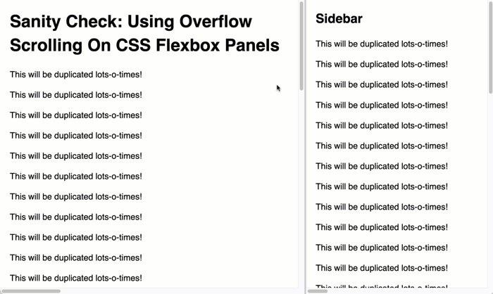
Woot woot! This works exactly as I hoped it would work! And, it works the same in Chrome, Safari, Firefox, and Edge! I no longer have a Virtual Machine running IE11, so I can't test that. But, I'm hoping no one with IE11 is still accessing my applications anyway.
Want to use code from this post? Check out the license.
Reader Comments
Post A Comment — ❤️ I'd Love To Hear From You! ❤️