CSS Flexbox, Overflow, Text-Overflow Ellipses, And A Separation Of Concerns
As I've gotten older (and hopefully wiser), I've grown to love the separation of concerns between layout and content. And while this separation of concerns incurs more verbosity, it leads to cleaner, easier-to-maintain HTML and CSS. That said, the separation of concerns is not always perfectly clean - sometimes there has to be some pragmatic overlap. Take, for example, the interplay between a CSS Flexbox container and the text-overflow property of its children. As I've come to understand, in order for text-overflow and an ellipses to work within a CSS Flexbox container, the Flexbox container has to take on an overflow property that is not strictly isolated by its own separation of concerns.
Run this demo in my JavaScript Demos project on GitHub.
View this code in my JavaScript Demos project on GitHub.
To see what I mean, I've put together a simple CSS Flexbox demo in which we have two Flexbox items: a left and right panel. The "flex layout", in this case, is trying to do nothing but layout the content. Then, within the flex layout, the content attempts to constrain itself using text-overflow: ellipses.
In the following code, I have two copies of the CSS Flexbox layout differentiated only by the fact that the second copy has an inline style attribute that applies overflow: hidden:
<!doctype html>
<html lang="en">
<head>
	<meta charset="utf-8" />

	<title>
		CSS Flexbox, Overflow, Text-Overflow Ellipses, And A Separation Of Concerns
	</title>

	<style type="text/css">

		.panels {
			border: 1px dashed black ;
			display: flex ;
			padding: 10px 10px 10px 10px ;
			max-width: 630px ;
		}
		.panels__left {
			border: 1px solid red ;
			flex: 1 1 auto ;
			padding: 10px 10px 10px 10px ;
		}
		.panels__right {
			border: 1px solid blueviolet ;
			flex: 0 0 auto ;
			margin-left: 10px ;
			padding: 10px 10px 10px 10px ;
		}

		/*
			Even though the long-text container is setup to truncate text and show an
			ellipses as needed, it STILL needs a constraint - something to tell it not to
			grow horizontally past a certain point.
		*/
		.long-text {
			border: 1px solid goldenrod ;
			overflow: hidden ;
			padding: 5px 5px 5px 5px ;
			text-overflow: ellipsis ;
			white-space: nowrap ;
		}

	</style>
</head>
<body>

	<h1>
		CSS Flexbox, Overflow, Text-Overflow Ellipses, And A Separation Of Concerns
	</h1>

	<h2>
		Flexbox Item Without Overflow Settings
	</h2>

	<div class="panels">
		<div class="panels__left">

			<div class="long-text">
				Watching John with the machine, it was suddenly so clear. The Terminator
				would never stop, it would never leave him... it would always be there.
				And it would never hurt him, never shout at him or get drunk and hit him,
				or say it couldn't spend time with him because it was too busy. And it
				would die to protect him. Of all the would-be fathers who came and went
				over the years, this thing, this machine, was the only one who measured
				up. In an insane world, it was the sanest choice.
			</div>

		</div>
		<div class="panels__right">
			Terminator 2
		</div>
	</div>

	<h2>
		Flexbox Item With <code>overflow: hidden</code>
	</h2>

	<div class="panels">
		<div class="panels__left" style="overflow: hidden ;">

			<div class="long-text">
				Watching John with the machine, it was suddenly so clear. The Terminator
				would never stop, it would never leave him... it would always be there.
				And it would never hurt him, never shout at him or get drunk and hit him,
				or say it couldn't spend time with him because it was too busy. And it
				would die to protect him. Of all the would-be fathers who came and went
				over the years, this thing, this machine, was the only one who measured
				up. In an insane world, it was the sanest choice.
			</div>

		</div>
		<div class="panels__right">
			Terminator 2
		</div>
	</div>

</body>
</html>
Again, note that the only difference between the two CSS Flexbox layouts is that the second one has an inline style:
<div class="panels__left" style="overflow: hidden ;">
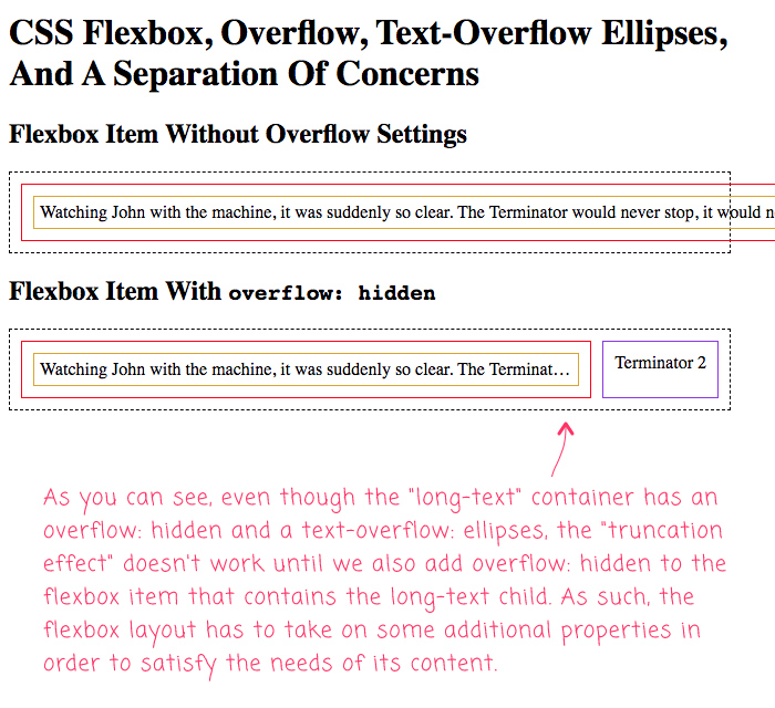
And, when we run run this in the browser, we get the following output:

As you can see, in the first example, the text just runs right off the screen despite the fact that the CSS Flexbox layout has a max-width set. We don't get our text-truncation effect until we also add overflow: hidden to the CSS Flexbox item. It turns out, in order for this to work in a flexible manner, we have to add some "less clean" constraints to the flex item, even though we'd really prefer to have those constraints isolated within the content.
ASIDE: We could also set a fixed-width on the
long-textcontent container. However, at that point, we'd lose the "flex" nature of the "flexbox" layout.
Anyway, this was mostly a note to self about some quirky behavior of the CSS Flexbox layout; and how I can get the text-overflow ellipses to work when I am trying my best to separate layout concerns from content concerns. Sometimes, in a pragmatic world, we have to allow those concerns to bleed across boundaries just a little bit.
Want to use code from this post? Check out the license.
Reader Comments
Ben. I thought you had to use:
With
For non flex containers, as well? Well, put it this way...that is what I have always done, without testing whether it is necessary:)
@Charles,
That's correct - if you look at my
.long-textclass, it has both theoverflow: hiddenand thetext-overflow: ellipsesproperties on it. Which is why if I were to, for example, do something like this:... then, I would have gotten the ellipses to show up; but, the content wouldn't have been matching the size of the Flexbox item. In order to get the ellipses to work and to get it grow to the size of the flexbox item, then I had to add the
overflowto the flexbox item as well.