Styling A Movie Cast List Using A Definition List And CSS Flexbox
For me, Flexbox is a game-changer. It's probably the most exciting thing to happen to CSS since absolutely-positioned elements and rounded corners. Last night, while reflecting on the power of Flexbox, I had an idea for a fun little code-kata: trying to recreate the styling of a movie cast list - the one with a center-line of dots - using CSS Flexbox and an HTML Definition List.
Run this demo in my JavaScript Demos project on GitHub.
View this code in my JavaScript Demos project on GitHub.
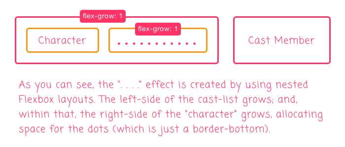
My strategy here is to use a nested Flexbox layout. Each item in the definition list would be a flexbox layout that separates the "Movie Character" from the "Cast Member". Then, the "Movie Character" flex item would, itself, be a flexbox layout that contains the "Movie Character" and the string of dots. In order for the string of dots to fill up the empty space, it will need to "grow" inside of the "Movie Character" layout, which itself has to grow to take up the space:

Now, we could have avoided the nested flexbox layout if I had an explicit HTML element for the dots. This explicit element could have just grown to take up all the space in-between. However, in an attempt to keep the HTML as "semantic" as possible, I wanted to use a Definition List, which only allows two items: DT and DD. As such, I am implementing the dots using the :after pseudo-element inside of the flexbox item.
The dots are then implemented as a border-bottom styling on the :after pseudo-element. I did attempt to get fancy and use border-image based on this blog post by Lucas Lemonnier; however, the dots came out looking kind of janky. So, I reverted back to using border-bottom:
<!doctype html>
<html lang="en">
<head>
	<meta charset="utf-8" />

	<title>
		Styling A Movie Cast List Using A Definition List And Flexbox
	</title>

	<style type="text/css">

		a {
			color: red ;
		}

		dl.cast-list {
			font-family: monospace ;
			font-size: 20px ;
			width: 500px ;
		}

		dl.cast-list div {
			/* Setup the DT (character) and DD (cast) items as a flexible layout. */
			display: flex ;
			margin: 5px 0px 5px 0px ;
		}

		dl.cast-list dt {
			/*
				Setup the DT element as a NESTED flexible layout. This will control the
				IMPLICIT TEXT element (character) and the :after pseudo-element (dots)
				layouts.
			*/
			display: flex ;
			/* Setup the DT (character) element to grow and take-up space. */
			flex: 1 1 auto ;
			margin: 0px 0px 0px 0px ;
		}

		dl.cast-list dt:after {
			border-bottom: 2px dotted #787878 ;
			content: "" ;
			/*
				Setup the pseudo-element (dots) to grow and take-up space. This will fill
				the white-space with "dots" because it growing inside of another layout
				which is also growing.
			*/
			flex: 1 1 auto ;
			margin: 0px 12px 5px 12px ;
		}

		dl.cast-list dd {
			/* Setup the DD (cast) element to shrink, allow for dots to fill space. */
			flex: 0 1 auto ;
			margin: 0px 0px 0px 0px ;
		}

	</style>
</head>
<body>

	<h1>
		Styling A Movie Cast List Using A Definition List And Flexbox
	</h1>

	<h2>
		<a href="https://www.imdb.com/title/tt0168987/">
			Better Than Chocolate
		</a>
	</h2>

	<dl class="cast-list">
		<div>
			<dt>Lila</dt>
			<dd>Wendy Crewson</dd>
		</div>
		<div>
			<dt>Maggie</dt>
			<dd>Karyn Dwyer</dd>
		</div>
		<div>
			<dt>Kim</dt>
			<dd>Christina Cox</dd>
		</div>
		<div>
			<dt>Frances</dt>
			<dd>Ann-Marie MacDonald</dd>
		</div>
		<div>
			<dt>Carla</dt>
			<dd>Marya Delver</dd>
		</div>
	</dl>

</body>
</html>
Now, you will notice that each item in the DL is wrapped in a DIV. While this used to be considered invalid markup, the DL element now allows items to be wrapped in a DIV (thank you Mozilla Developer Network!). By wrapping each item in a DIV, it allows us to pull each DT and DD element pair into an isolated flexbox layout.
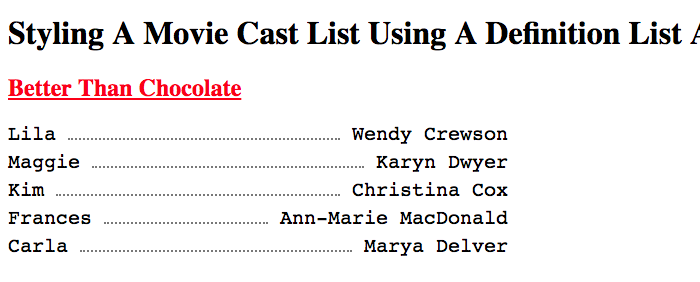
If we load this in the browser, we get the following output:

The dots in the border-bottom aren't the most beautiful dots; but, I think they are sufficiently well styled. What's nice about using border is that the browser does its best to no cut any dots in half. So, it might space them a bit oddly at parts; but, from what I've read, the browser will prioritize making the "corners" of the border look uniform.
Anyway, just a fun little Friday code-kata to close the week. I just love me some CSS Flexbox. I know that people are gaga for CSS Grid. But, Flexbox was my first love of the new CSS layouts.
Want to use code from this post? Check out the license.
Reader Comments
@All,
After I had posted this, several people in the Web Dev community suggested a few ways to simplify the CSS. As such, I wanted to quickly revisit this code-kata and share those solutions:
www.bennadel.com/blog/3625-revisiting-styling-a-movie-cast-list-using-a-definition-list-and-flexbox.htm
What a wonderful community, amiright?!