Applying CSS Flexbox To Pseudo-Elements
The other day, I was listening to Episode 14 of the CSS Podcast: Pseudo Elements, hosted by Una Kravets and Adam Argyle, when Adam said something quite thought-provoking: he mentioned that you can apply CSS Flexbox to pseudo-elements in order to perfectly align icons. I didn't know if we was referring to the pseudo-element being a flex-item? Or, if he meant applying display: flex to the pseudo-element itself. In the end, it doesn't really matter because both use-cases are awesome! As such, I wanted to take a quick look at what we can do with CSS Flexbox and a pseudo-element. And, for funzies, I'm throwing in the attr() function because I've never actually used it before.
Run this demo in my JavaScript Demos project on GitHub.
View this code in my JavaScript Demos project on GitHub.
To experiment with CSS Flexbox and pseudo-elements, I've created a demo in which I have a list of people; and, before each person, I'm going to include a little avatar-like element that contains the person's initials. Each person in the list has this type of HTML markup:
| <div data-initials="BC" class="person"> | |
| Bethany Chang | |
| </div> |
What you'll notice here is that the initials aren't in the text-content of the div element. Instead, they are being provided in the data-initials attribute. In the CSS, we're going to extract those initials using the attr(data-initials) function and then apply them to the view using the :before pseudo-element's content property.
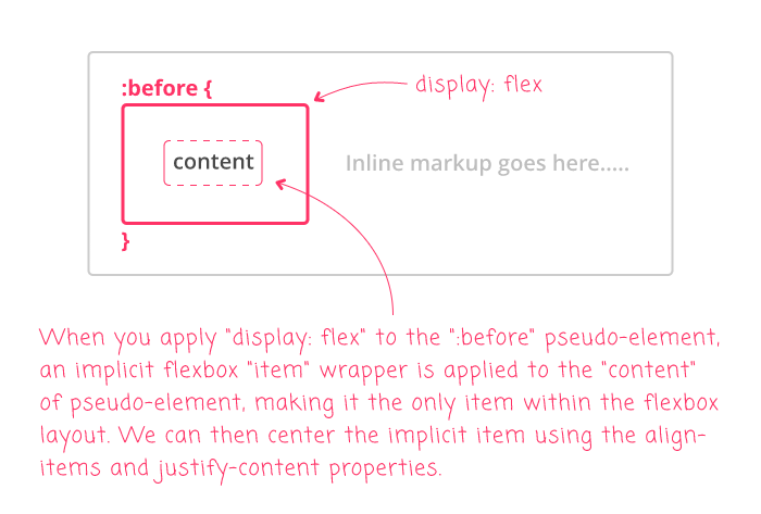
The :before pseudo-element is going to have display: flex, which will allow us to center the initials inside the rendered pseudo-element. This is a really cool feature of CSS Flexbox: when you give an element a Flex Layout, any text-nodes that are direct-descendants of that Flex layout receive an implicit flex-item wrapper complete with default flex values:

With the display: flex on our :before pseudo-element, and the implicit flex-item wrapper on the content, we can then use align-items and justify-content to horizontally and vertically center the content within the dimensions of the pseudo-element!
If this weren't a big enough bowl of awesome, we can make this even moar awesome by applying display: flex to the parent element as well (the div in our case)! By doing this, it makes the :before pseudo-element both a Flex-item and a Flex layout - oh chickens! This allows us to then space and align the pseudo-element relative to the person's name, which will, itself, receive an implicit flex-item wrapper.
Here's the code for the full demo:
| <!doctype html> | |
| <html lan="en"> | |
| <head> | |
| <meta charset="utf-8" /> | |
| <title> | |
| Applying CSS Flexbox To Pseudo-Elements | |
| </title> | |
| </head> | |
| <body> | |
| <h1> | |
| Applying CSS Flexbox To Pseudo-Elements | |
| </h1> | |
| <style type="text/css"> | |
| .person { | |
| align-items: center ; | |
| display: flex ; | |
| font-size: 20px ; | |
| margin: 10px 0px 10px 0px ; | |
| } | |
| .person:before { | |
| /* | |
| When we apply "display: flex" to the pseudo-element, the CONTENT within | |
| the pseudo-element is given an IMPLICIT WRAPPER, making it the only item | |
| in this local flexbox layout. This allows us to use "align-items" and | |
| "justify-content" as a means to center the CONTENT within the dimensions | |
| of the pseudo-element. | |
| */ | |
| align-items: center ; | |
| content: attr( data-initials ) ; | |
| display: flex ; | |
| justify-content: center ; | |
| /* Other styling ... */ | |
| background-color: #111111 ; | |
| border-radius: 100% 100% 100% 100% ; | |
| color: #ffffff ; | |
| font-family: monospace ; | |
| font-size: 12px ; | |
| font-weight: 600 ; | |
| height: 36px ; | |
| letter-spacing: 1px ; | |
| line-height: 12px ; | |
| margin-right: 10px ; | |
| text-transform: uppercase ; | |
| width: 36px ; | |
| } | |
| </style> | |
| <div data-initials="CD" class="person"> | |
| Connor Donovan | |
| </div> | |
| <div data-initials="RA" class="person"> | |
| Rachel Ali | |
| </div> | |
| <div data-initials="RM" class="person"> | |
| Robert Marsden | |
| </div> | |
| <div data-initials="AD" class="person"> | |
| Aaliyah Derrick | |
| </div> | |
| <div data-initials="AE" class="person"> | |
| Alena Esparza | |
| </div> | |
| <div data-initials="DD" class="person"> | |
| Dannielle Douglas | |
| </div> | |
| <div data-initials="FR" class="person"> | |
| Florrie Romero | |
| </div> | |
| <div data-initials="BC" class="person"> | |
| Bethany Chang | |
| </div> | |
| <div data-initials="NH" class="person"> | |
| Nabeel Hartley | |
| </div> | |
| <div data-initials="NA" class="person"> | |
| Neil Anthony | |
| </div> | |
| <!-- Names generated using: https://www.name-generator.org.uk/quick/ --> | |
| </body> | |
| </html> |
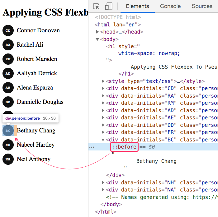
As you can see, both .person and .person:before are being given a Flex layout. And, when we run this code in the browser, we get the following output:

CSS Flexbox is so awesome! Here, we have the :before pseudo-element acting as a sibling Flex-item to the person's name, which allows us to space it and center-align it. But, it's also acting as its own, local Flex-layout, which allows us to center the text-content of the initials both horizontally and vertically within the avatar-like circle.
CSS Flexbox is the best thing since sliced bread border-radius!
And, the attr() function is pretty cool as well. I've never used it before this; but, I kind of enjoy how clean it allows us to keep the markup. Of course, sometimes it is nice to have explicit elements that 1) make the code a bit less magical and, 2) allow us to hook into the HTML using element-selectors. But, still, I love the elegance of it all.
Anyway, just a fun little code-kata on CSS Flexbox, which has become my go-to layout technology (since I still have to support IE11 at work).
Want to use code from this post? Check out the license.
Reader Comments
Ben, to me your blog posts are of an enormous value, because it doesn't deal only about cfml, but covers about a lot of stuff, mysql, javascript, angular, vue, adobe cf, lucee cf CSS and more. You're still sharing so much to our community, even though your startup has evolved to a big and well known app. Others would have gone underground. Hope to see your posts as long as you still have time to do so. Thank you!
@Andreas,
Thank you very much for the kind words! I'm just happy to be adding some value when I can. Here's to a long and fruitful future!
Thanks for sharing this technique Ben. TIL!
@Hassam,
Awesome, glad you found this helpful :)