Exercise List: The Prototype And Interface Driven Design
Now that we have the basic idea of what our ColdFusion application, Exercise List, is supposed to do, it's time to figure out what it is supposed to look like. Inspired by the likes of Clark Valberg and Hal Helms, I am going to be employing an Interface Driven Design strategy in which I nail down what the application will do from a visual and functional standpoint before I even worry about the data model and the underlying architecture. The idea here is that interface discovery period will help dictate what the underlying data model will need to be, and, in fact, while putting together the mockups, I realized that I was missing an essential data point: symmetry of an exercise (bilateral vs. unilateral).
Ordinarily, the mockup would be broken out into a clickable prototype, but for the size of this project (and the time contstraints I am giving myself), I don't think that is a requirement. I am envisioning the site as only having four pages:
- Search exercises
- View exercise detail
- Add / Edit exercise
- Delete Exercise
This could, of course, be more complicated and I could have spent more time on the design, but I didn't want to lose sight of the project goal; this is not so much about how to properly take a project from inception to delivery - this is more about learning how to program with objects in ColdFusion in an object oriented fashion. And, while getting a clear understanding of the underlying data model is important, I don't think we have to linger on the design for that understanding to be available in this ColdFusion application.
So, here are the designs that I have come up with; the designs have been cropped a bit on the right so as to fit within the confines of my web site (they will be bigger in reality).
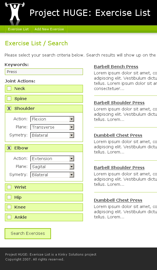
Search Exercises
In this screen, the search criteria will be on the left and then the search results will be loaded on the right. When the joint criterion are not in use, their boxes will be minimized so as not to clutter the interface.
| |
|
|
||
| |
 |
|
||
| |
|
|
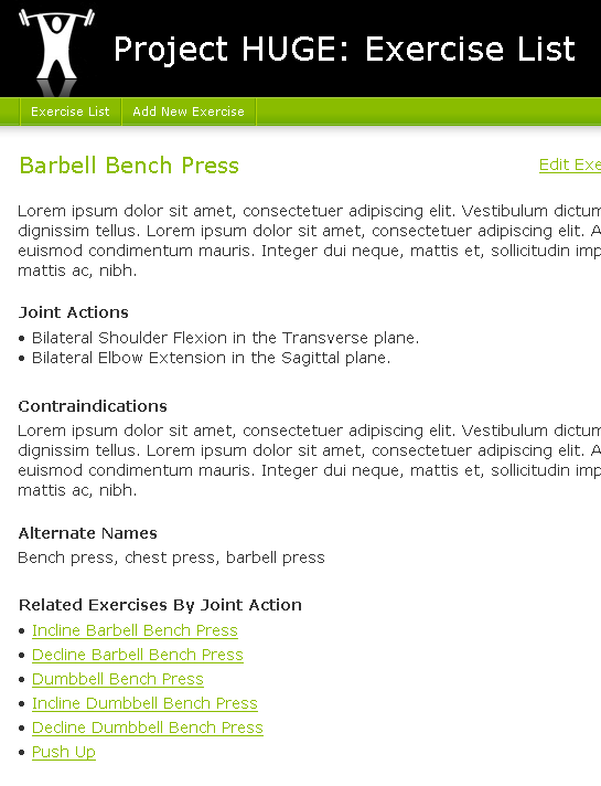
View Exercise Detail
This is a straight forward detail page. For the most part, it is just echoing back the data in the database. At the bottom, though, it does list out related exercises. I believe that this work by matching up joint actions (but necessarily planes of movement). The Edit and Delete links will only be provided on this page.
| |
|
|
||
| |
 |
|
||
| |
|
|
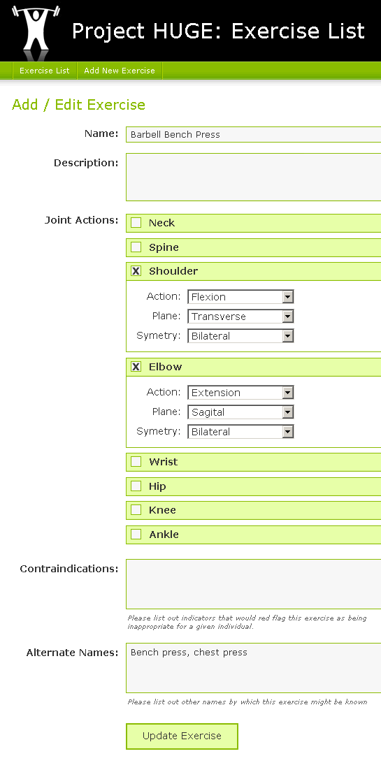
Add / Edit Exercise
I figure that both the Add Exercise and Edit Exercise screens will be the same. The difference is that one will populate the data during form initialization.
| |
|
|
||
| |
 |
|
||
| |
|
|
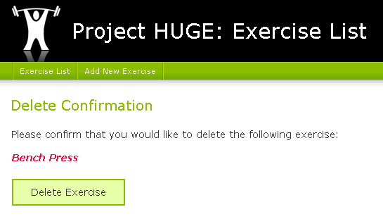
Delete Exercise
The delete confirmation page is small. This is just to make sure that you don't delete things accidentally. I would like to make logical deletes rather than physical deletes to the data, but we don't have to tackle that idea just yet.
| |
|
|
||
| |
 |
|
||
| |
|
|
So those are the four screens that I am envisioning. I wish I had time to follow good Interface Driven Design practices, but I just need to get moving on this. I think that mockups will provide me with enough direction to get a phase I application (procedural code) done with no problem.
Note: I am not a designer. I know that there is stuff that could be improved about this interface, but I am fighting the urge to spend too much time on it. There is more important stuff to be tackled. And, assuming I write some nice, clean XHTML and CSS code, changing the look and feel of the application midstream should be an easy task.

Reader Comments
Are you going to make this Web 2.0?
Modals for delete?
Drag and drop to create the exercise routine?
When you check the box, the choices should "sliiiiide" open.
If only there was a JavaScript library that could help make that stuff easy! If only.
@Glen,
The one thing I was envisioning, at least for Phase I, was the Sliiiide feature for the joint actions. The rest of the Web 2.0 stuff, I think will just distract me from my primary goal - to learn more about OOP.
But naturally, jQuery will be in my header ;)