Using Margins With Four-Sided Positioning In CSS
Thirteen years ago, Ryan Jeffords blew my mind when he introduced me to four-sided positioning of absolute/fixed position elements. Yesterday, Scott Tolinski and Ivor Padilla took that to the next level when they explained to me that margins also work with four-sided positioning. And, to be honest, this kind of broke my brain, especially with regard to, margin:auto. As such, I needed to sit down and try it out for myself.
Run this demo in my JavaScript Demos project on GitHub.
View this code in my JavaScript Demos project on GitHub.
To be clear, I know that you can use CSS margin in conjunction with positioned elements. However, I'm quite certain that I've only ever applied a margin when using two-sided positioning. Before CSS Flexbox existed, I would often use janky techniques to center elements within the viewport.
This might be done with fixed-size margins:
.centered {
	position: fixed ;
	width: 600px ;
	height: 400px ;
	/* Position the top-left corner at center of screen. */
	top: 50% ;
	left: 50% ;
	/* Translate element back-up and back-over. */
	margin-top: -200px ; /* Half of 400. */
	margin-left: -300px ; /* Half of 600. */
}
Or, in more modern browsers, this might be done with an element-relative 3D-translation:
.centered {
	position: fixed ;
	width: 600px ;
	height: 400px ;
	/* Position the top-left corner at center of screen. */
	top: 50% ;
	left: 50% ;
	/* Translate element back-up and back-over. */
	transform: translate3d( -50%, -50%, 0px ) ;
}
Both approaches have pros-and-cons; but, both operate on an element that is only positioned on two sides. Where things get crazy is when you apply both four-sided positioning and margins:
.centered {
	position: fixed ;
	width: 600px ;
	height: 400px ;
	/* Position at edges of viewport. */
	top: 0 ;
	right: 0 ;
	bottom: 0 ;
	left: 0 ;
	/* Translate element to center of viewport. */
	margin: auto ;
}
The part that breaks my brain here is that the positioning offsets aren't even really applying to the element itself but more so to the element's "margin box". I don't know how to explain this well because I don't have the right words.
I mean, if the viewport is 1,000 px wide and the element is 600 px wide, what the heck does left:0 ; right:0 even mean?! It's straight-up bonkers! BONKERS!
And, what's even more bonkers is that you can then use margin:auto to center an element within that "margin box".
To examine this concept, I created an Alpine.js playground in which I can dynamically apply CSS styles to a position:absolute box that is contained within a position:relative parent element:
/* Creating a relative-position container. */
.container {
	position: relative ;
	width: 650px ;
	height: 200px ;
}

/* Creating an absolute-position element within the container. */
.box {
	position: absolute ;
	width: 50px ;
	height: 50px ;
	/*
		Set sensible defaults for all of these properties. Then, we will use the
		Alpine.js model bindings below to override a subset of these values and
		move the box around within its container.
	*/
	bottom: auto ;
	left: auto ;
	right: auto ;
	top: auto ;
	margin: 0 ;
}
I'm using the browser default values for the .box positioning. But then, I'm using Alpine.js to dynamically bind new CSS values to the style property:
<div class="container">
	<div
		class="box"
		x-bind:style="boxStyles[ selectedIndex ].styles">
	</div>
</div>
The boxStyles array is a collection of 25 different variations that move the box element around to the various areas of the container. For example:
var boxStyles = [
	{
		label: "Top-left",
		styles: {
			top: "10px",
			left: "10px"
		}
	},
	{
		label: "Center-center",
		styles: {
			top: "10px",
			left: "10px",
			right: "10px",
			bottom: "10px",
			margin: "auto"
		}
	},
	{
		label: "Mid-bottom-mid-right",
		styles: {
			top: "50%",
			left: "50%",
			right: "10px",
			bottom: "10px",
			margin: "auto"
		}
	},
	// ... more options ...
];
When I then run this Alpine.js demo and select different options, I can see the box moving around within the container:
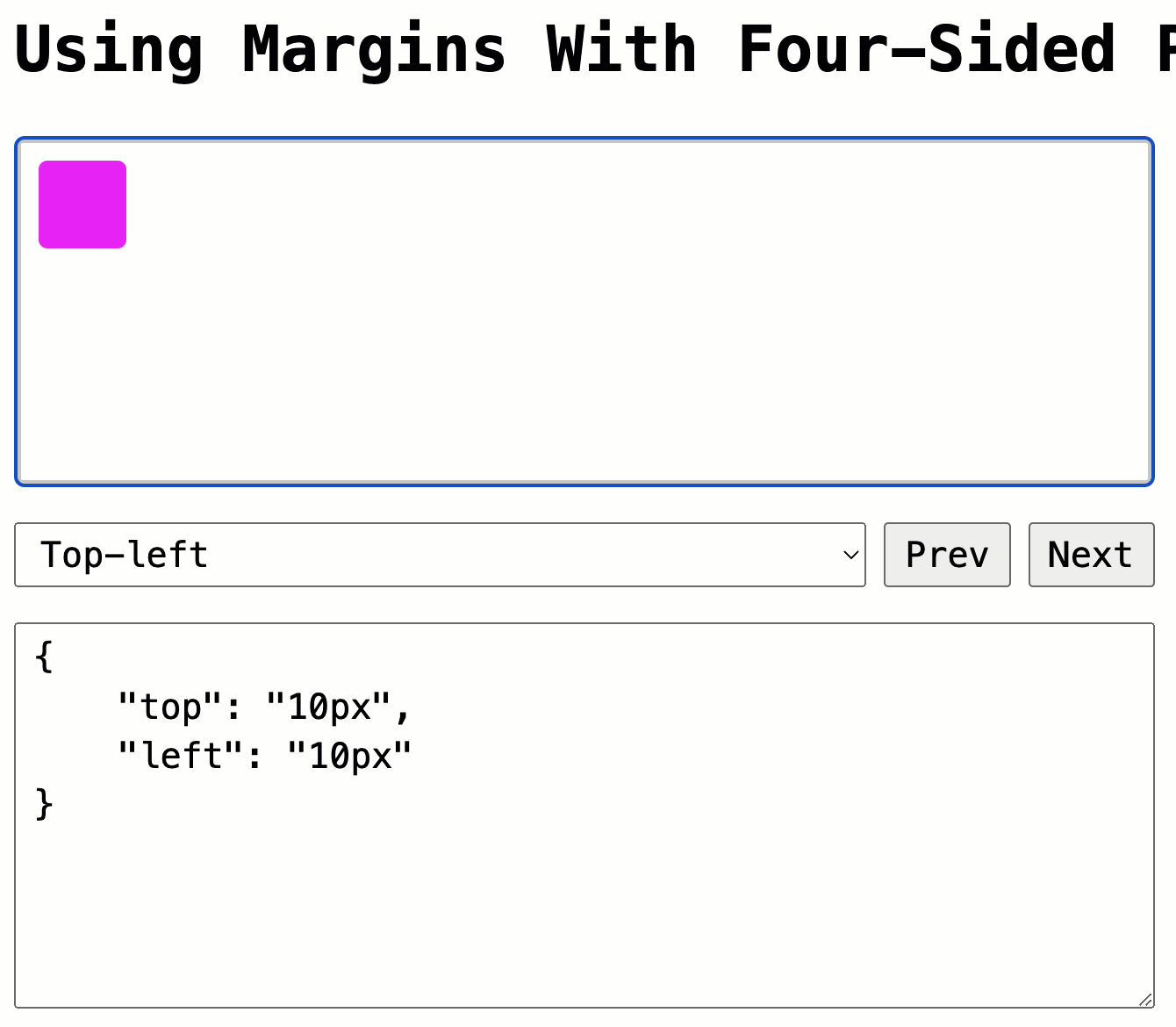
In this demo, the box has a fixed-size, which is needed in order for the margin values to work their magic. However, you can get around this constraint in very modern browsers by using CSS fit-content for the width and height. That said, I haven't used this property myself; and, I'm not sure if it's considered (by Google's Baseline project) be "widely available" yet since it still required a vendor-prefix in late 2021.
I'm going to need to let this all sink in a bit - it still hurts my brain. But, this is a very cool technique; and, having it in my back pocket is almost certainly going to be a value-add.
With that said, here's the full code for the HTML page:
<!doctype html>
<html lang="en">
<head>
	<link rel="stylesheet" type="text/css" href="./main.css" />
</head>
<body x-data="demo">

	<h1>
		Using Margins With Four-Sided Positioning In CSS
	</h1>

	<style type="text/css">

		/* Creating a relative-position container. */
		.container {
			position: relative ;
			width: 650px ;
			height: 200px ;
		}

		/* Creating an absolute-position element within the container. */
		.box {
			position: absolute ;
			width: 50px ;
			height: 50px ;
			/*
				Set sensible defaults for all of these properties. Then, we will use the
				Alpine.js model bindings below to override a subset of these values and
				move the box around within its container.
			*/
			bottom: auto ;
			left: auto ;
			right: auto ;
			top: auto ;
			margin: 0 ;
		}

	</style>

	<div
		x-ref="container"
		tabindex="1"
		@mousedown="$refs.container.focus()"
		@keydown="moveBox( $event )"
		class="container">
		<div
			class="box"
			x-bind:style="boxStyles[ selectedIndex ].styles">
		</div>
	</div>

	<!--
		We're using the Alpine.js X-MODEL directive to choose from a collection of style
		options. As the selectedIndex is updated, the new set of styles will be applied
		to the box above (changing its top/bottom/left/right/margin properties).
	-->
	<div class="tools">
		<select x-model.number="selectedIndex">
			<template x-for="( option, i ) in boxStyles">
				<option x-text="option.label" :value="i"></option>
			</template>
		</select>
		<button @click="prevOption()">
			Prev
		</button>
		<button @click="nextOption()">
			Next
		</button>
	</div>

	<!-- Output the currently-selected styles (for debugging). -->
	<textarea
		readonly
		class="debugger"
		x-text="JSON.stringify( boxStyles[ selectedIndex ].styles, null, 4 )">
	</textarea>

	<script type="text/javascript" src="./main.js" defer></script>
	<script type="text/javascript" src="../../vendor/alpine/3.13.5/alpine.3.13.5.min.js" defer></script>

</body>
</html>
And, here's the full code for my Apline.js demo component:
function demo() {

	var boxStyles = [
		// Top row.
		{
			label: "Top-left",
			styles: {
				top: "10px",
				left: "10px"
			}
		},
		{
			label: "Top-mid-left",
			styles: {
				top: "10px",
				left: "10px",
				right: "50%",
				marginInline: "auto"
			}
		},
		{
			label: "Top-center",
			styles: {
				top: "10px",
				left: "10px",
				right: "10px",
				marginInline: "auto"
			}
		},
		{
			label: "Top-mid-right",
			styles: {
				top: "10px",
				left: "50%",
				right: "10px",
				marginInline: "auto"
			}
		},
		{
			label: "Top-right",
			styles: {
				top: "10px",
				right: "10px"
			}
		},
		// Mid-top row.
		{
			label: "Mid-top-left",
			styles: {
				top: "10px",
				left: "10px",
				bottom: "50%",
				marginBlock: "auto"
			}
		},
		{
			label: "Mid-top-mid-left",
			styles: {
				top: "10px",
				left: "10px",
				right: "50%",
				bottom: "50%",
				margin: "auto"
			}
		},
		{
			label: "Mid-top-center",
			styles: {
				top: "10px",
				left: "10px",
				right: "10px",
				bottom: "50%",
				margin: "auto"
			}
		},
		{
			label: "Mid-top-mid-right",
			styles: {
				top: "10px",
				left: "50%",
				right: "10px",
				bottom: "50%",
				margin: "auto"
			}
		},
		{
			label: "Mid-top-right",
			styles: {
				top: "10px",
				right: "10px",
				bottom: "50%",
				marginBlock: "auto"
			}
		},
		// Center row.
		{
			label: "Center-left",
			styles: {
				top: "10px",
				left: "10px",
				bottom: "10px",
				marginBlock: "auto"
			}
		},
		{
			label: "Center-mid-left",
			styles: {
				top: "10px",
				left: "10px",
				right: "50%",
				bottom: "10px",
				margin: "auto"
			}
		},
		{
			label: "Center-center",
			styles: {
				top: "10px",
				left: "10px",
				right: "10px",
				bottom: "10px",
				margin: "auto"
			}
		},
		{
			label: "Center-mid-right",
			styles: {
				top: "10px",
				left: "50%",
				right: "10px",
				bottom: "10px",
				margin: "auto"
			}
		},
		{
			label: "Center-right",
			styles: {
				top: "10px",
				right: "10px",
				bottom: "10px",
				marginBlock: "auto"
			}
		},
		// Mid-bottom row.
		{
			label: "Mid-bottom-left",
			styles: {
				top: "50%",
				left: "10px",
				bottom: "10px",
				marginBlock: "auto"
			}
		},
		{
			label: "Mid-bottom-mid-left",
			styles: {
				top: "50%",
				left: "10px",
				right: "50%",
				bottom: "10px",
				margin: "auto"
			}
		},
		{
			label: "Mid-bottom-center",
			styles: {
				top: "50%",
				left: "10px",
				right: "10px",
				bottom: "10px",
				margin: "auto"
			}
		},
		{
			label: "Mid-bottom-mid-right",
			styles: {
				top: "50%",
				left: "50%",
				right: "10px",
				bottom: "10px",
				margin: "auto"
			}
		},
		{
			label: "Mid-bottom-right",
			styles: {
				top: "50%",
				right: "10px",
				bottom: "10px",
				marginBlock: "auto"
			}
		},
		// Bottom row.
		{
			label: "Bottom-left",
			styles: {
				left: "10px",
				bottom: "10px"
			}
		},
		{
			label: "Bottom-mid-left",
			styles: {
				left: "10px",
				right: "50%",
				bottom: "10px",
				marginInline: "auto"
			}
		},
		{
			label: "Bottom-center",
			styles: {
				left: "10px",
				right: "10px",
				bottom: "10px",
				marginInline: "auto"
			}
		},
		{
			label: "Bottom-mid-right",
			styles: {
				left: "50%",
				right: "10px",
				bottom: "10px",
				marginInline: "auto"
			}
		},
		{
			label: "Bottom-right",
			styles: {
				right: "10px",
				bottom: "10px"
			}
		}
	];

	// ------------------------------------------------------------------------------- //
	// ------------------------------------------------------------------------------- //

	return {
		boxStyles: boxStyles,
		selectedIndex: 0,
		/**
		* I initialize the component.
		*/
		init() {

			this.$refs.container.focus();

		},
		/**
		* I select the previous styles option.
		*/
		prevOption() {

			if ( ! this.boxStyles[ --this.selectedIndex ] ) {

				this.selectedIndex = ( this.boxStyles.length - 1 );

			}

		},
		/**
		* I select the next styles option.
		*/
		nextOption() {

			if ( ! this.boxStyles[ ++this.selectedIndex ] ) {

				this.selectedIndex = 0;

			}

		},
		/**
		* I move the box around by mapping the style options onto a two-dimensional grid
		* and then calculating row/column changes.
		*/
		moveBox( event ) {

			var optionCount = this.boxStyles.length;
			var columnCount = 5;
			var rowCount = ( optionCount / columnCount );

			// Calculate the row/column based on the selected index.
			var columnIndex = ( this.selectedIndex % columnCount );
			var rowIndex = Math.floor( this.selectedIndex / columnCount );

			// Move to the next row or column based on keyboard event.
			switch ( event.key ) {
				case "ArrowUp":
					if ( --rowIndex < 0 ) {

						rowIndex = ( rowCount - 1 );

					}
				break;
				case "ArrowDown":
					if ( ++rowIndex === rowCount ) {

						rowIndex = 0;

					}
				break;
				case "ArrowLeft":
					if ( --columnIndex < 0 ) {

						columnIndex = ( columnCount - 1 );

					}
				break;
				case "ArrowRight":
					if ( ++columnIndex === columnCount ) {

						columnIndex = 0;

					}
				break;
				default:
					return;
				break;
			}

			// Map the new row and column onto the selected style index.
			this.selectedIndex = ( ( rowIndex * columnCount ) + columnIndex );

		}
	};

}
Happy Friday!
Want to use code from this post? Check out the license.

Reader Comments
It's Friday, man! Common! You shouldn't scramble our brains going into the weekend! That's just wrong 😜
It's awesome to know that center/center is not our only option! Though, it's where my brain goes e-v-e-r-y-time!
OK. I have no idea what:
Does, but, using my intuition, I can imagine each side, pulling the element with an equal amount of force.
So, logically this must centre the element, because no single positioning property should take priority?
However, it seems like
margin: auto;is the magic sauce that seems to energise the pulling forces of each positioning property.Anyway, this is the mental model, I will use to try and remember this. ☺️
I will now read the rest of your article.
This kind of exploration, really reignites my interest in CSS. 🙏
By the way, thanks for fixing the Safari bug. Everything works perfectly now, in your blog comment section. 👊
@Charles Robertson,
I think that's a super helpful way to think about it! Thanks
@Chris,
Mwwwaaa ha ha ha ha! 🤪
@Charles,
Nice to get confirmation that Safari iOS is working now for the comments. Yeah, that was a really frustrating bug. Originally, what was happening is that as you type, I was trapping the
inputevent, and using it torequestSubmit()of the comment form using a hidden "Preview" button. And, that button was configured to target a Hotwire Turbo Frame. But, for whatever reason, on iOS, Turbo was submitting the form with the wrong action (save vs. preview).I ended up using
fetch()to grab the preview content and then just inserted it into the page usinginnerHTML, bypassing all the Turbo logic. Frustrating, but at least it's working now.re: the CSS stuff, the part that feels so crazy to me is that I can have:
... and it will center it between the half-way point and the right-edge of the screen. I'm accepting that it works; but, my brain is still fighting me on the logic 😆
@Ben Nadel,
Cheers for the reply.
The interesting thing, is that it seems:
Is parsed first and then
Seems to work as a sub property?
Which, quite frankly, is bonkers 😀
@Charles,
I am not sure what you mean by "parsed first." To be honest, I'm having a hard time building a mental model for how this works. The best I can do is that the top/right/bottom/left build a "containment box". And then the margin aligns the content within the containment box. But, I have no idea if this is anywhere near accurate, technically speaking.
Also, for anyone else where, there is a somewhat new CSS property,
inset(introduced in 2021), that is a short hand for the other edge properties. The settings:... can be written as:
I didn't want to use it in my post because I thought it might be distracting / confusing. I only recently learned about this CSS property from the Syntax FM podcast.
@Ben Nadel,
My initial thoughts were that the order of properties should be important.
Because left/right and top/bottom are two equal & opposite positioning properties, I would have thought that if both properties existed in the same selector, the second one would cancel the first one.
Therefore:
I would have expected only the
left: 50%to have had any effect. So, my prediction would have been that the element might be positioned, in the centre, from the element's left hand corner.However, in reality it seems that the second property, adjusts the positioning of the first. Maybe this is a positive thing, because it adds more flexibility, even if it isn't exactly intuitive.
@Charles,
I don't know very much about the technical under-pinnings of CSS, but I believe it gets parsed into an "Object Model" - so the order of the properties shouldn't matter too much (unless we start talking specificity).
As far as I'm concerned, it's half logic, half magic 😆
Post A Comment — ❤️ I'd Love To Hear From You! ❤️
Post a Comment →