Four-Sided Positioning Plays Nicely With Scale() Transformations In CSS
A decade ago, Ryan Jeffords changed my life forever when he introduced me to the concept of four-sided positioning in CSS. Since then, four-sided positioning - along with CSS Flexbox - have become a mainstay of my modal-window content strategy. As much as I love positioning in CSS, I've never felt very comfortable using the transform property; and, I wasn't sure how something like transform: scale() would work in conjunction with four-sided positioning in CSS. So, I wanted to give it a quick exploration.
Run this demo in my JavaScript Demos project on GitHub.
View this code in my JavaScript Demos project on GitHub.
In today's web application landscape, I believe most use of animation is overkill. I think it represents a general lack of empathy on behalf of the designers; and, does little more than slow down user interactions that would otherwise be instantaneous. That said, one place that I do appreciate subtle animation is when bringing a modal window into view.
Since a modal window opens on top of other content, it can be a little jarring, even disorienting; especially if the modal window is "full screen" and completely eclipses the content that the user was just viewing. By animating a modal window into view (just shy of instantaneously), we can foster a more organic understanding of the user interface (UI) layering.
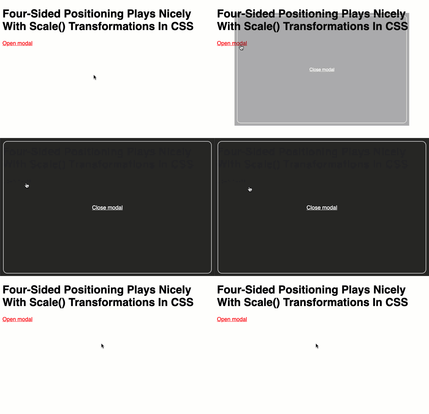
This is where CSS transform: scale() comes into play. We can use scale() to "grow" the modal window into view. And, I'm excited to see that this works seamlessly with my use of four-sided positioning. To see this in action, I've put together a demo in which we can toggle the rendering of a modal window that uses both four-sided positioning and a @keyframes animation containing scale():
<!doctype html>
<html lang="en">
<head>
	<meta charset="utf-8" />
	<title>
		Four-Sided Positioning Plays Nicely With Scale() Transformations In CSS
	</title>
	<link rel="stylesheet" type="text/css" href="./demo.css">
	<style type="text/css">

		.modal {
			/* Four-sided positioning. */
			bottom: 0px ;
			left: 0px ;
			position: fixed ;
			right: 0px ;
			top: 0px ;

			/*
				Animating the modal element into view: our modal-enter keyframes are
				going to use SCALE() (and opacity) to gradually transition the modal
				element into its fixed position layout.
			*/
			animation-duration: 1s ; /* NOTE: Absurdly SLOW for demo purposes. */
			animation-fill-mode: both ;
			animation-iteration-count: 1 ;
			animation-name: modal-enter ;
			animation-timing-function: ease-out ;
		}

		@keyframes modal-enter {
			from {
				opacity: 0 ;
				transform: scale( 0.7 ) ;
			}
			to {
				opacity: 1 ;
				transform: scale( 1.0 ) ;
			}
		}

	</style>
</head>
<body>

	<h1>
		Four-Sided Positioning Plays Nicely With Scale() Transformations In CSS
	</h1>

	<p>
		<a class="toggle">Open modal</a>
	</p>

	<!--
		This modal window will use FIXED positioning and have a four-sided (top, right,
		bottom, left) arrangement. It will also fade into view using CSS transitions.
	-->
	<template>
		<div class="modal">
			<a class="toggle">Close modal</a>
		</div>
	</template>


	<!-- Load scripts. -->
	<script type="text/javascript" src="../../vendor/jquery/3.6.0/jquery-3.6.0.min.js"></script>
	<script type="text/javascript">

		var modal = null;
		var template = $( "template" );

		// We'll use event-delegation so that we can capture the click event in the
		// modal, which isn't even rendered yet.
		$( document ).on( "click", ".toggle", toggleModal );

		// I show / hide the modal window by adding it to or removing it from the DOM
		// (Document Object Model) tree, respectively.
		function toggleModal() {

			if ( modal ) {

				modal.remove();
				modal = null;

			} else {

				modal = $( template.prop( "content" ).firstElementChild.cloneNode( true ) )
					.appendTo( document.body )
				;

			}

		}

	</script>

</body>
</html>
As you can see, when the modal window element is added to the DOM, our @keyframes animation transitions the element from scale(.7) to scale(1). That, along with our four-sided positioning, makes for a pleasant rendering experience:
NOTE: The duration here is absurdly slow for the purposes of the demonstration. In production, this timing should be just shy of instantaneous.

It's great that four-sided positioning and transform:scale() play so nicely together in CSS. It will make for much easier modal-window authoring. Especially when you throw in CSS Flexbox, which is one of the greatest things since sliced-bread.
Epilogue on Animating Elements Out of View
CSS @keyframes are great because they make many types of entry animations dead simple! However, since the element-in-question needs to be in the DOM in order to animate, @keyframes don't work seamlessly with exit animations. The goods news is, most things don't need exit animations.
The reason entry animations can be nice is that it gives the user time to construct a mental model of how the elements on the page relate to each other. Removing an element from the page - in response to a user-interaction - does not require the same form of hand-holding. When a user goes to "close" something, that thing can be closed instantaneously - the user already understands what it is they are trying to do; there is no enhanced UX by slowly (and painfully) removing that element from view.
Want to use code from this post? Check out the license.
Reader Comments
@All,
After posting this, I got to thinking about the
prefers-reduced-motionmedia query; and, how we might alter the entry-animation of the modal window using that media query:www.bennadel.com/blog/4132-applying-multiple-animation-keyframes-to-support-prefers-reduced-motion-in-css.htm
I outline three different approaches; but, ultimately, I think I prefer one that applies multiple
@keyframesanimations to the same element (using progressive enhancement).