Embracing Asymmetrical Design And Overcoming The Harmful Effects Of "text-overflow: ellipsis" In CSS
At InVision, few things give me as much joy as sitting in on a user interview. Users help me see and experience our product with fresh eyes. And one piece of fresh feedback that keeps coming up over-and-over again is the harmful effect that text-overflow: ellipsis has on our product's accessibility. I already talked a bit about the user experience (UX) of text truncation after reading Accessibility for Everyone by Laura Kalbag; but today, I wanted talk about why we so often end up in this terrible place; and how we can fight back by embracing asymmetrical design in our products.
Humans love symmetry. We find symmetry to be very attractive. Our brains may even be hard-wired through evolution to process symmetrical data more efficiently. So, it's no surprise that, as designers, we try to build symmetry into our product interfaces and layouts. It makes them feel very pleasant to look at.
Unfortunately, data is not symmetrical. Which is why every Apple product demo is mocked for showcasing users that all have four-letter names: Dave, John, Anna, Sara, Bill, Jill, etc.. Apple uses this type of symmetrical data because it fits cleanly into their symmetrical user interface (UI) design.
Once you release a product into "the real world", however, and users start to enter "real world data" into it, you immediately see that asymmetrical data, shoe-horned into a symmetrical design, can start to look terrible. Well, actually, it may still look good; but, it provides a terrible user experience.
To fix this, we need to lean into an asymmetric reality. We need to embrace the fact that data is asymmetric and we need to design user interfaces that can expand and contract to work with the asymmetry, not against it. To borrow from Bruce Lee, we need to build user interfaces that act more like water:
You must be shapeless, formless, like water. When you pour water in a cup, it becomes the cup. When you pour water in a bottle, it becomes the bottle. When you pour water in a teapot, it becomes the teapot. Water can drip and it can crash. Become like water my friend. — Bruce Lee
With browsers finally having robust support for tools like CSS Flexbox (even in IE11) and CSS Grid, we have relatively easy ways to build flexible, responsive design. It's not the tooling that continues to limit us - it's us. We're the problem.
We need to let go. We need to get over the fact that shapes of various sizes may not "look great", but they "work great". And that's what our users care about: how things work. Our users have jobs to do and they don't care nearly as much about the design as you do.
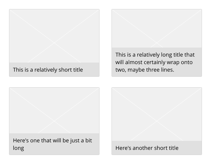
Here's an example of an asymmetric design using a boxy layout:

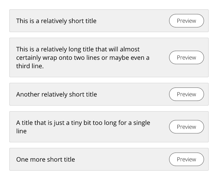
And, here's an example of an asymmetric design using a listy layout:

Notice that in each one of these designs, some portion of the user interface is expanding to work with the asymmetrical characteristics of the data (in this case, a variable-length title). Does the variation look quirky? Definitely. Will the users care? Absolutely not. At least, not about the design - they will care, and appreciate, the fact that they can easily see their data and quickly identify their next course of action.
The world of user-generated content is asymmetric in nature. We need to stop forcing it into a symmetrical box. There's no doubt that a user interface has to have some constraints, otherwise it breaks. But, there's certainly no need to constrain things as much as we do today. To create a better user experience, we just need to loosen things up a little bit and become more like water.

Reader Comments