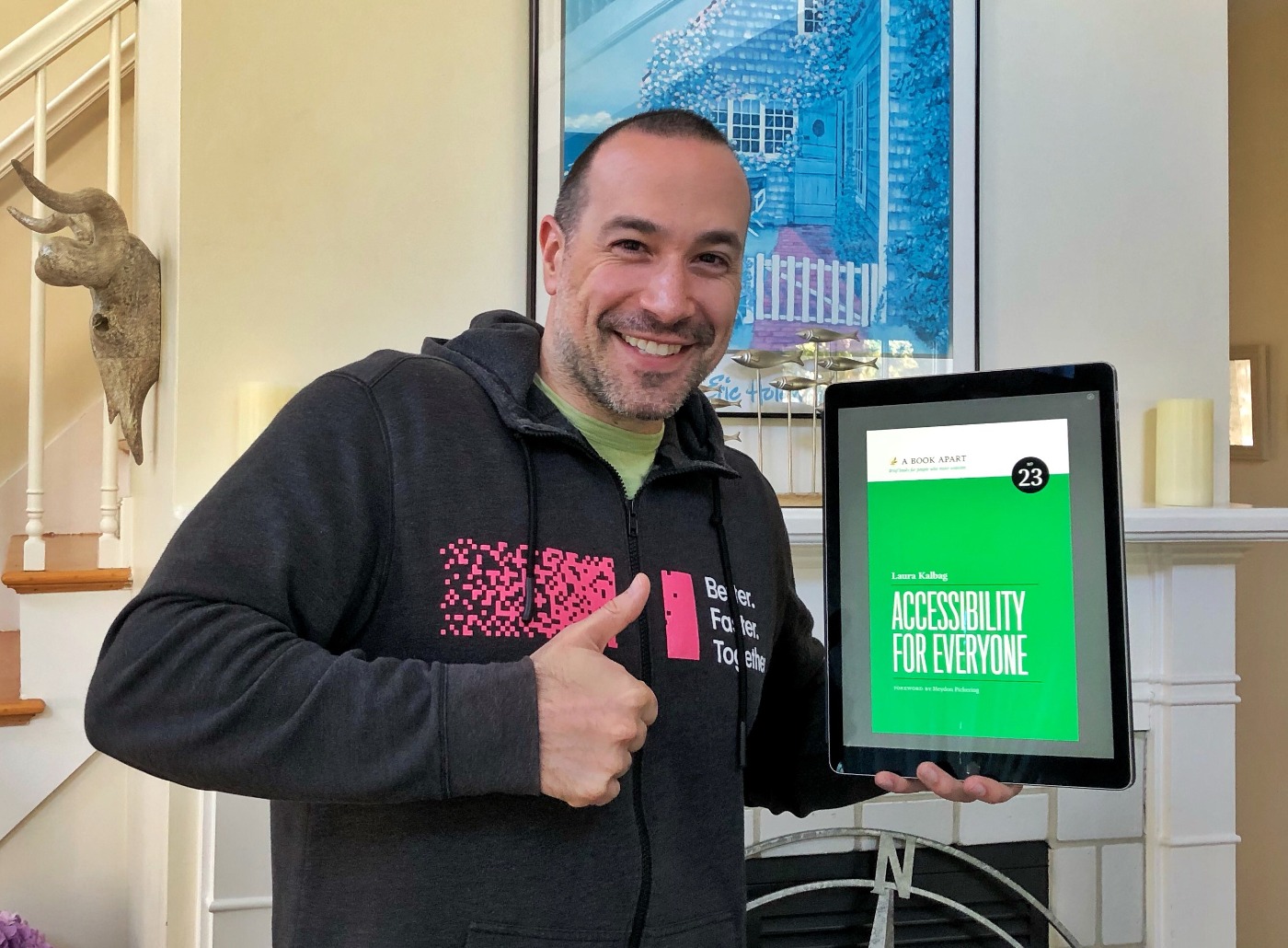
A Book Apart: Accessibility For Everyone By Laura Kalbag
On a recent episode of the JavaScript Jabber podcast, Chris DeMars talked about the importance of website accessibility. The panel discussion became a little bit contentious as the group boiled accessibility down to a "moral" issue; and, whether or not you "think right" towards people. It made me feel guilty about my general lack of understanding on how accessibility manifests in a website. So, in an attempt to take a step towards educating myself, I went to see if A Book Apart had any relevant publications. Luckily, they published Accessibility For Everyone by Laura Kalbag. Like all A Book Apart publications, Laura's book was concise, easy-to-consume, and chock full of good information.

This assumption probably speaks directly to my ignorance about accessibility; but, I expected this book to be a tutorial on how to apply WAI-ARIA (Web Accessibility Initiative - Accessible Rich Internet Applications) roles to my website and web application markup. This is not that book. Laura touches upon ARIA and its importance for assistive technologies; but, leaves a deeper dive on the topic as an exercise for the reader.
Instead, Accessibility For Everyone is more of a reality check on accessibility; and about how we - as Product Teams - can incorporate an accessibility mindset into our entire design, development, and testing workflow.
Part of this starts with understanding the scope of accessibility issues. Historically, I've thought about website accessibility as being a concern for our "blind users". But, as Laura points out, visual impairments are only one context to take into account. At some point in their life, most users will have some sort of impairment, whether it be a temporary or a long-term condition:
- Visual impairments.
- Auditory impairments.
- Motor impairments.
- Cognitive impairments.
- Vestibular disorders and seizures.
And then, there are environmental issues like trying to view a website in low-light or bright-light; using a desktop computer or a mobile device; attempting to navigate with a mouse or the keyboard.
In many ways, Accessibility For Everyone is a manifesto on building empathy with your users. And, not just with the users that have acute impairments - with all users. Because, as it turns out, when you make a website or a web application more accessible, you make it better for everyone.
This concept was well articulated in the distinction between "accessible design" and "universal design":
The distinction between universal and accessible design is subtle but important. Accessible design considers the needs of people with disabilities. So, for example, accessible design might result in a building having a wheelchair ramp attached to its far side, as an afterthought. It might not be convenient for people using wheelchairs, and it's unlikely to be used by people who find it faster to use the stairs, but at least there's some form of access (FIG 1.3).
On the other hand, universal design considers the needs of a diverse human population. Universal design might result in a building with a combined ramp and stairs, opening access to all and forcing no one to go out of their way to choose one option or the other (FIG 1.4). (Page 12)
One thing that I really loved was Laura's notion of "generosity". That we can be generous in our choices:
We can make small, thoughtful changes to our websites. We can be generous with our design. We can make great, rather than just adequate, experiences. (Page 103)
For whatever reason, this really puts me in the right mindset. It helps elevate the concept of accessibility from that of a "requirement" to that of an "opportunity" for love.
And then, this statement, which was just priceless:
If avoiding being sued is the only reason you care about making a website available to a wide audience - particularly those with disabilities - then perhaps creating products for other people isn't for you. (Page 156)
Accessibility For Everyone by Laura Kalbag wasn't exactly what I expected it to be. But, in many ways, it was just what I needed. It reminded me about the importance of accessibility; and about how to "think right" towards my most diverse set of users; and - gosh darn it - about the importance of semantic HTML. But, this isn't the end - it's just beginning. I'm still not competent when it comes to the application of universal design; but, at least I know that it's something I need to work on.
For people using keyboard navigation, focus styles (frequently displayed by browsers as a combination of dotted borders and blue glows) are indispensable. You might recognize these styles if you've removed them in the past when they didn't fit in with your site's aesthetic (FIG 5.16). (Don't worry, I won't tell anyone. Just go put them back now.) (page 118)
Reader Comments
@All,
After reading this book, I am now taking pause and reconsidering
text-overflow: hidden:www.bennadel.com/blog/3624-reconsidering-text-overflow-ellipsis-as-a-design-smell-and-accessibility-concern.htm
In most cases, I think that we can probably rethink the design in order to better accommodate more open-ended user content.