eCard Layout Using Absolute And Relative CSS Positioning
Yesterday, after I opened my free ColdFusion eCard section, someone asked me how the cards were layed out. While, mine is a bit more complicated (since multiple cards share CSS rules and then overwrite for their own particular layout), this is the basis for all of the eCards:
<!DOCTYPE HTML PUBLIC "-//W3C//DTD HTML 4.01 Transitional//EN">
<html>
<head>
	<title>eCard Display Demo</title>

	<!-- Set page styles. -->
	<style type="text/css">

		div.ecard {
			border: 2px solid red ;
			position: relative ;
			height: 120px ;
			width: 245px ;
			}

		div.ecard p {
			font-family: verdana ;
			font-size: 11px ;
			margin: 0px 0px 0px 0px ;
			overflow: hidden ;
			position: absolute ;
			}

		div.ecard p.to {
			border: 2px solid gold ;
			left: 10px ;
			top: 10px ;
			width: 105px ;
			}

		div.ecard p.from {
			border: 2px solid pink ;
			left: 125px ;
			top: 10px ;
			width: 105px ;
			}

		div.ecard p.message {
			border: 2px solid blue ;
			left: 10px ;
			top: 40px ;
			width: 220px ;
			}

	</style>
</head>
<body>

	<p>
		Some intro text.
	</p>

	<div class="ecard">

		<p class="from">
			To: Samantha
		</p>
		<p class="to">
			From: Ben
		</p>
		<p class="message">
			Hey Sam, did you catch the last episode of Heroes?
			It's getting pretty cool. I can't wait for a real
			serious face off between Peter and Sylar. That's
			gonna be craaaazy!!
		</p>

	</div>

	<p>
		Some footer text.
	</p>

</body>
</html>
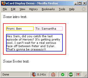
If you were to browse that in another window, it would look this like this:

Notice that the HTML markup which is very "information oriented", once displayed, has a highly formatted layout. What is the secret to this black magic? Relative and absolute positioning. Understanding these two and how they interact has truly changed the way I build web page layouts.
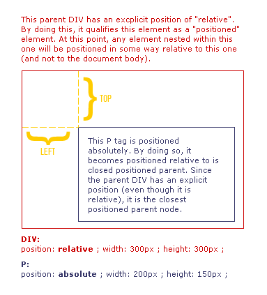
When an element is defined as having an "absolute" positioning, this means that it is positioned absolutely in relation to its closest "positioned" parent. What does it mean for an element in the DOM to be "positioned"? Well, all nodes have a default position of "relative"; however, an element is not considered "positioned" until it has an explicit positioning. This CSS rule can be for relative or absolute positioning. See this graphic for some more detail:

Taking that, my eCard layout becomes very clean. The eCard DIV is positioned relatively. This allows its own layout to be inline with the natural flow of the document. The nested paragraphs have an absolute positioning. This allows them to be positioned absolutely relatively to the div (their closest positioned parent) which means that both the DIV and the nested P tags will have a highly formatted layout and yet still flow with the natural layout of the document.
Want to use code from this post? Check out the license.

Reader Comments
Just a note, provide a proper, semantic test code since a lot of newcomers tend to copy it as is.
@Zoffix,
What do you mean? If you tell me what a "proper, semantic test code" is, I will be more than happy to provide it.