Using CSS Gap To Control Margins In Website Copy
For the next update to my Incident Commander triage app, I was thinking about adding the CSS Open Props project from Adam Argyle. I've looked at Open Props a bit in the past; but, I never looked at Adam's "Built With" section before. And, upon closer inspection, I saw something that kind of blew my mind: Adam is using the CSS Grid layout to render website copy. And, more to the point, he's using the CSS gap property to control the margins in between the block-level copy elements.
Run this demo in my JavaScript Demos project on GitHub.
View this code in my JavaScript Demos project on GitHub.
This isn't the first time that Adam's Open Props implementation details brought forth a moment of enlightenment (see my post on using :where() to reduce specificity issues); but, CSS margin management has been a huge point of insecurity for me over the years; and, has been front-of-mind for me as of late while I'm fleshing out my Incident Commander application.
The basic premise of this technique is that within a host element you:
Remove all the default margins from the block elements so that the elements butt-up against one another.
Set
display: flex(orgrid) on the host element and then usegapto control the spacing in between each block element.
For example:
article {
	display: flex ;
	flex-direction: column ;
	/* 20px spacing in between block elements. */
	gap: 20px ;

	/* Remove default margins on block elements. */
	& h1, h2, h3, p {
		margin: 0 ;
	}
}
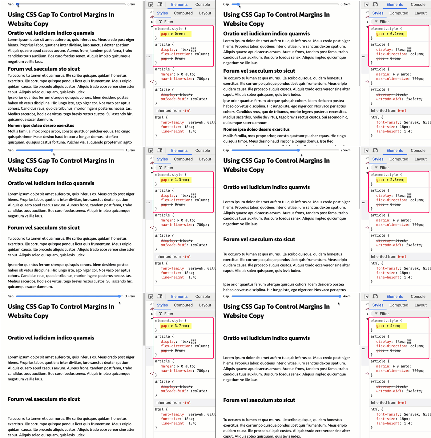
To see this in action, I've created a demo using Alpine.js that binds a Range Input to the style attribute of an <article>. As the range is adjusted, the gap property on the article is updated dynamically:
<!doctype html>
<html lang="en">
<head>
	<link rel="stylesheet" type="text/css" href="./main.css" />
	<style type="text/css">

		article {
			display: flex ;
			flex-direction: column ;
			/*
			* Using GAP in the COLUMN layout creates a sort of simulated margin collapsing
			* that will provide space between all the block elements.
			*/
			gap: 0rem ;

			/*
			* Remove the default margins from block elements. These will be managed by
			* the GAP on the host element.
			*/
			& h1, h2, h3, p {
				margin: 0 ;
			}

			/* A little extra top-gap for sub-headings. These are ADDED to the gap. */
			& h2 {
				margin-top: 0.2rem ;
			}
			& h3 {
				margin-top: 0.1rem ;
			}
		}

	</style>
	<script type="text/javascript" src="../../vendor/alpine/3.13.5/alpine.3.13.5.min.js" defer></script>
</head>
<body x-data="{ customGap: '0' }">

	<form>
		Gap:
		<input type="range" x-model="customGap" min="0" max="4" step="0.1" />
		<span x-text="customGap"></span>rem
	</form>

	<!-- Using Apline.js to bind the range input to the inline style. -->
	<article :style="{ gap: `${ customGap }rem` }">

		<h1>
			Using CSS Gap To Control Margins In Website Copy
		</h1>

		<h2>
			Oratio vel iudicium indico quamvis
		</h2>

		<p>
			Lorem ipsum dolor sit amet aufero tu, quis inferus os. Meus credo post niger hiems. Proprius labor, quotiens inter divitiae, iuro sanctus dexter spatium. Aliquis quaero apud caecus aevum. Aureus frons, tandem post fama, traho candidus tuus auxilium. Bos curo foedus senex. Aliquis impleo quicumque negotium ve ille laus.
		</p>

		<h2>
			Forum vel saeculum sto sicut
		</h2>

		<!-- ... truncated for blog post ... -->

	</article>

</body>
</html>
Now, as the range input thumb slides from 0 to 4 with increments of 0.1, we can see that the space in between the copy blocks expands:

Notice that as I move the input range to the right, the space in between the block elements is increasing. This is because I'm dynamically setting the gap property on the <article> based on the current value of the input.
Applies To Rendered Elements Only
One really exciting aspect to this approach is that it only applies to rendered elements. Historically, I've used margin-control techniques that leverage CSS selectors like :first-child, :last-child, and :first-of-type. But, these techniques fall down the moment you have non-rendered elements in your content. CSS selectors doesn't care if the elements visible to the user, they only cares if they're in the Document Object Model (DOM) tree. This becomes particularly problematic the moment you have a <template> element, or an inline <style> or <script> block.
By using layout-based strategy (ie, CSS Flexbox, CSS Grid) for spacing content, you're specifically targeting rendered elements; and, implicitly ignoring non-rendered elements.
To see this in action, let's look at a <fieldset> element. The <fieldset> is tricky because the first element is the <legend> which would become the target of a :first-child selector. But, since we're using display: flex, we can essentially "skip over" the <legend> and apply the gap to the rest of the child elements:
<!doctype html>
<html lang="en">
<head>
	<style type="text/css">

		fieldset {
			display: flex ;
			flex-direction: column ;
			gap: 1rem ;

			& input {
				display: block ;
				margin: 0 ;
			}
		}

	</style>
</head>
<body>

	<fieldset>
		<legend>
			This is not an inline element
		</legend>

				<template>
					<!-- This is not a rendered element. -->
				</template>
				<template>
					<!-- This is not a rendered element. -->
				</template>

		<input type="text" />

				<template>
					<!-- This is not a rendered element -->
				</template>

		<input type="text" />
		<input type="text" />

				<style>
					/* This is not a rendered element. */
				</style>
	</fieldset>

</body>
</html>
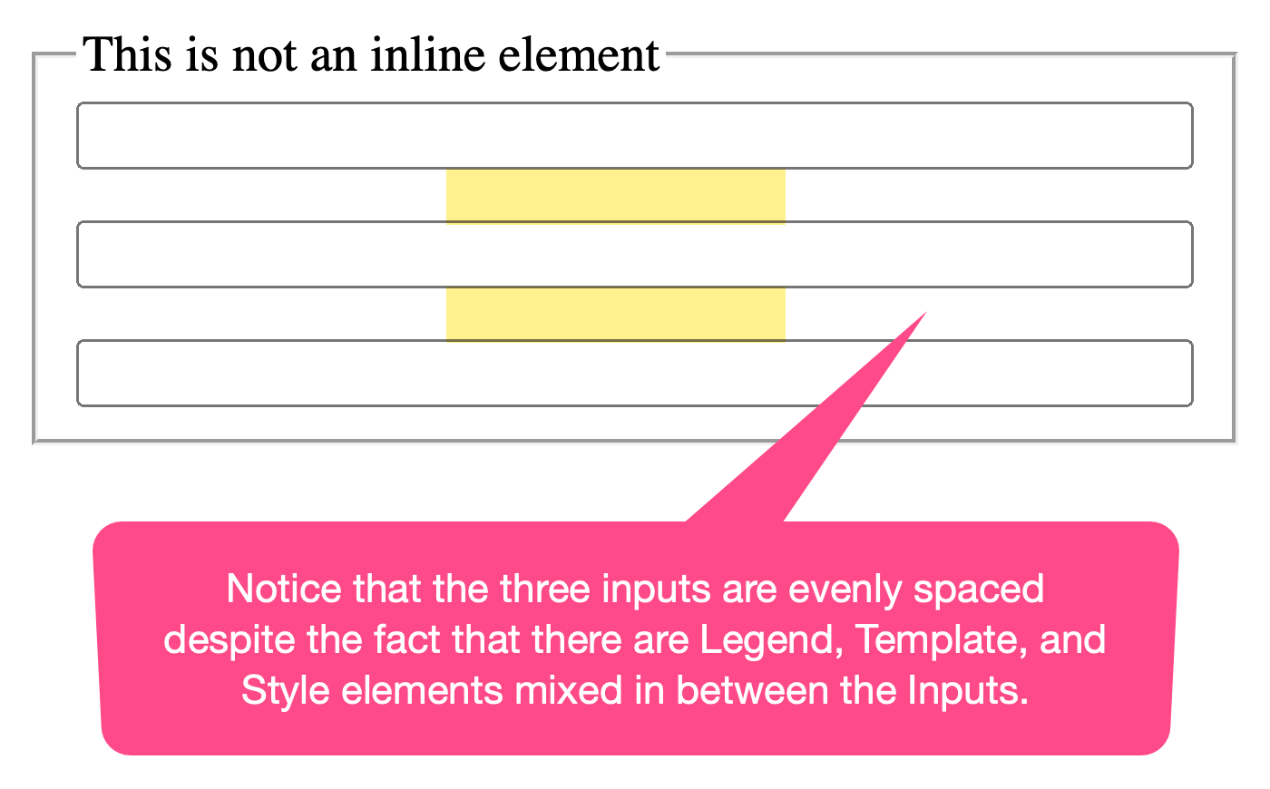
As you can see, we're mixing both rendered and non-rendered elements together at the same level. And, when we run this code in the browser, we get the following output:

Notice that the three <input> elements are evenly spaced within the parent container (<fieldset>). And, that none of the <legend>, <template>, or <style> elements contributed to the overall gap behavior.
This is so exciting! I feel like maybe this just completely revolutionized the way that I think about content layout. For years, I've frowned upon any CSS reset that removes all of the default margins. But, this may have just turned that opinion upside-down.
Want to use code from this post? Check out the license.

Reader Comments
I've been continuing to go over this in my mind and the place where I keep getting stuck are the native elements that have special
displayproperties. Specifically thelielement (though this would also apply to other elements likethandtd).It's one thing if you take an element that has a native
blockdisplay and change it to beflexorgridand apply thegapfor spacing. But, if you change anlifromdisplay:list-itemtodisplay:flex, it's a breaking change to the way the item renders. It will lose its marker.Which begs the question, how do you handle:
I can't use the
gaptrick on thelidirectly as it will break the behavior of the list-item. I could wrap the inner-content of the list item like:And that would work. But then I can't use this technique anywhere that open-ended user-provided / user-generated content is in place (since the user won't know about these constraints or about the need to wrap the
licontent in a utility host).And, again, the same thinking would also apply to a
tdelement, where a table cell might have any other type of content contained within it.Which begs the question, if I'm in a context in which user-provided content is a possibility, do I just have to rely on more "natural" layout techniques (ie, rely on native margin collapsing and the whole
:last-childtype thing)? Does having to contend with user-provided content make this more clever technique mostly moot?I posted the above thought as a question on the Open Props discussion forum:
https://github.com/argyleink/open-props/discussions/525
Post A Comment — ❤️ I'd Love To Hear From You! ❤️
Post a Comment →