Styling An Element When An Input's Placeholder Is Being Shown In CSS
The other day, I learned that there is a pseudo-class in CSS that allows us to target an input when its placeholder is being shown to the user: :placeholder-shown. Normally, I don't like to mess with inputs too much; but, in my Dig Deep Fitness app, I thought this CSS selector could be a nice way to progressively enhance the User Interface (UI) during exercise performance. For each exercise, the user must enter their weights and reps. And, I can use :placeholder-shown CSS pseudo-class to emphasize the previous workout's efforts until the user enters their current information.
Run this demo in my JavaScript Demos project on GitHub.
View this code in my JavaScript Demos project on GitHub.
When a user performs an exercise, they are performing "sets". Each "set" is a composite of a Weight selection and the number of Reps executed at that weight. The goal of resistance training is to progress the weights over time. As such, it can be very help (perhaps essential) to know what weight you performed last time.
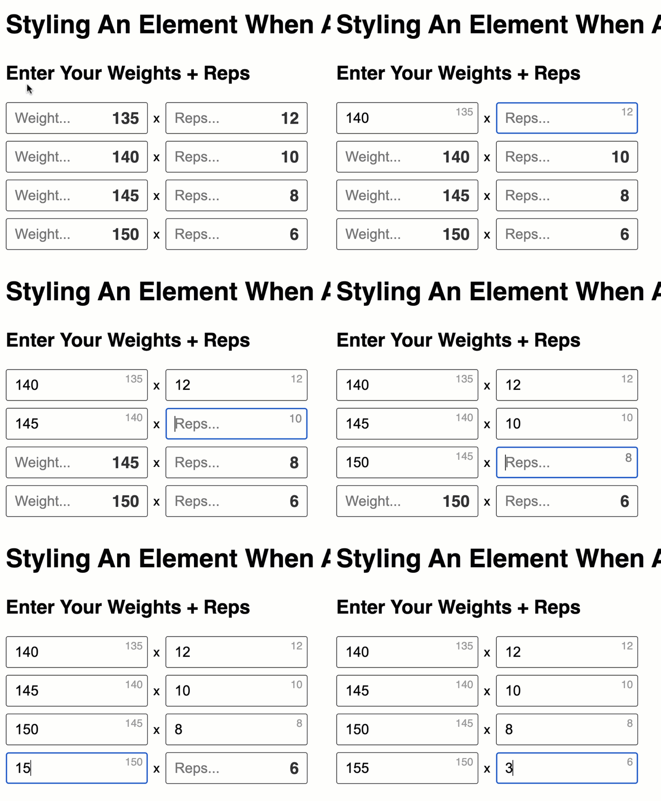
To help guide the user, I'm overlaying the previous workout's weights and reps over the inputs in the current workout. By default, the overlay will be small, gray, and out-of-the-way so as not to be distracting. But, I will then use the :placeholder-shown CSS pseudo-class to emphasize the previous efforts while the user is just viewing the page.
Here is the effect I want to achieve:

Notice how the previous workout's effort rendering starts out big, bold, and in-your-face. But, once the user focuses each input and starts to type, the :placeholder-shown CSS pseudo-class becomes invalidated and the overlays recede into the corner and become light, gray, and out-of-the-way.
Here is the code I have for this:
<!doctype html>
<html lang="en">
<head>
	<meta charset="utf-8" />
	<meta name="viewport" content="width=device-width, initial-scale=1" />
	<link rel="stylesheet" type="text/css" href="./main.css" />
	<style type="text/css">

		.set {
			align-items: center ;
			display: flex ;
			gap: 8px ;
		}
		.set__panel {
			position: relative ;
			width: 200px ;
		}
		.set__input {
			width: 100% ;
		}
		/*
			In order to help make the weight / reps entry easier for the user, we're going
			to overlay the previous workout's weights / reps on top of the current work-
			out's inputs. The initial rendering will be small, grey, and out-of-the-way so
			as to be helpful but NOT distracting or intrusive.
		*/
		.set__overlay {
			color: #999999 ;
			font-size: 15px ;
			line-height: 1 ;
			pointer-events: none ;
			position: absolute ;
			right: 7px ;
			top: 6px ;
			transition: all 300ms ease-out ; /* Some razzle-dazzle for the demo. */
		}
		/*
			BUT, we can then PROGRESSIVELY ENHANCE THE UI to be a bit bigger and bolder
			when the current workout's inputs have their placeholders being shown.
		*/
		.set__input:not(:focus):placeholder-shown + .set__overlay {
			color: #333333 ;
			font-size: 23px ;
			font-weight: bolder ;
			right: 12px ;
			top: 11px ;
		}

	</style>
</head>
<body>

	<h1>
		Styling An Element When An Input's Placeholder Is Being Shown In CSS
	</h1>

	<h2>
		Enter Your Weights + Reps
	</h2>

	<div class="set">
		<!-- Weight entry. -->
		<div class="set__panel">
			<input
				type="text"
				placeholder="Weight..."
				class="set__input"
			/>
			<!-- Previous entry for weight (to be shown overlaid on input). -->
			<span class="set__overlay weight">
				135
			</span>
		</div>
		x
		<!-- Reps entry. -->
		<div class="set__panel">
			<input
				type="text"
				placeholder="Reps..."
				class="set__input"
			/>
			<!-- Previous entry for reps (to be shown overlaid on input). -->
			<span class="set__overlay reps">
				12
			</span>
		</div>
	</div>

	<!-- ---------------------------------------------------------------------------- -->
	<!-- ---------------------------------------------------------------------------- -->

	<!--
		In order to pain a better picture of the effect, I'm just going to CLONE the
		above DIV several times in order to make the demo more interactive.
	-->
	<script type="text/javascript">

		// Previous workout efforts.
		var efforts = [
			{ weight: 140, reps: 10 },
			{ weight: 145, reps: 8 },
			{ weight: 150, reps: 6 }
		];
		var node = document.querySelector( ".set" );

		for ( var effort of efforts ) {

			var clone = node.cloneNode( true );
			clone.querySelector( ".set__overlay.weight" ).textContent = effort.weight;
			clone.querySelector( ".set__overlay.reps" ).textContent = effort.reps;

			document.body.append( clone );

		}

	</script>

</body>
</html>
ASIDE: In this particular context (Dig Deep Fitness), I think there is a bit of a User Experience (UX) problem: does the overlay represent the previous efforts for the user? Or, does it represent the desired efforts for the current workout? That's obviously something I have to tackle with my information architecture. But, that's neither here-nor-there in terms of the demo. I'm just thinking out-loud.
I think this is a neat effect - though, to be clear, I added the CSS transition property in order to give the demo some razzle-dazzle. In reality, I dislike most animations on the web and will likely remove that in my application. That said, the :placeholder-shown CSS pseudo-class is a cool feature; and, I believe it will come in handy when progressively enhancing a user experience.
Want to use code from this post? Check out the license.
Reader Comments
Hey Ben, just as you build this app, I wondered if you've thought about using the Ionic Framework? It would save you a ton of heavy lifting and works on Angular (one of your favs).
https://ionicframework.com/
We've built 3 or 4 apps on Ionic now with much success. CF backend.
@Dave,
I've known of Ionic for a long time - I believe they've been around since the early Angular.js days. But, I haven't actually tried it out. I was just looking at the site and the widgets do look really slick. Once I get the core ColdFusion-driven functionality in place, I'll definitely come back and take a look at this. All things "Design System" and componentry are not really my strong-suit, so any boost I can get would be awesome 💪
Post A Comment — ❤️ I'd Love To Hear From You! ❤️
Post a Comment →