Using Layer Blend Modes To Highlight Text In Graphics Design
This is just a note to self. But, for what feels like decades, I've struggled to clearly highlight text within a graphics file. Historically, I've positioned a yellow rectangle above the target text; and then, lowered the opacity on the rectangle in order to allow the highlighted text to show-through. Of course, as I lower the opacity, the strength of the highlight itself decreases. Over the weekend, however, it finally occurred to me that layer blend modes may hold the answer. And, after a little trial-and-error in InVision Studio, I finally had my eureka moment!
To be clear, I don't have a good grasp on what layer blend modes really do. I've been very slowly working my way through Simon Foster's Udemy course on Affinity Photo, which has been helping. But, I couldn't tell you the differences or the affects of the various blend modes.
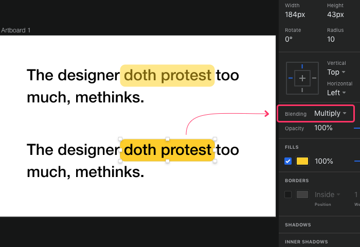
That said, in InVision Studio, if I set the blend mode of my yellow highlight rectangle to Multiply, it gives me exactly what I am looking for. In the following screenshot, the first highlight uses my old technique - a rectangle with a reduced opacity; and, the second highlight simply sets the blend mode on the highlight to Multiply:

As you can see, in the first approach, the highlighted text looks washed out since it is being partially obscured by the rectangular overlay. In the second approach, however, where the rectangular overlay has full opacity with its blend mode set to Multiple, the text shows through with a luxurious richness that can only be described as decadent!
I am sure the graphics-savvy people out there are laughing at my n00bish graphics skillz. It took me years to figure this out. But, better late that never. It's probably time I go finish (and then re-watch) Simon Foster's Udemy course.

Reader Comments