Desktop Safari Seems To Add Extra Padding To CSS Flexbox Item Inside List Item
Earlier this morning, in a post about trying to center-align a text-overflow: ellipsis effect using CSS Flexbox, I mentioned that I ran into a really odd desktop Safari behavior that appeared to add extra padding to the first Flexbox item if it was contained within a list item. When I Googled for this, I didn't find anything; so, I just wanted to share the behavior here for anyone else who might be searching for it.
Run this demo in my JavaScript Demos project on GitHub.
View this code in my JavaScript Demos project on GitHub.
The code for this demonstration is quite simple. I have a CSS Flexbox container that has two items. And, each of the items has a border. Then, I render this Flexbox container twice: once in the top-level BODY tag and once in an LI tag:
<!doctype html>
<html>
<head>
	<meta charset="utf-8" />

	<title>
		Desktop Safari Seems To Add Extra Padding To CSS Flexbox Item Inside List Item
	</title>
</head>
<body>

	<h1>
		Desktop Safari Seems To Add Extra Padding To CSS Flexbox Item Inside List Item
	</h1>

	<!-- A simple Flexbox container in the DOM. -->
	<div class="flexbox-container">
		<span class="flexbox-item1">I am the first item</span>
		<span class="flexbox-item2">I am the second item</span>
	</div>

	<ul>
		<li>

			<!-- The SAME simple Flexbox container, this time in a UL/LI context. -->
			<div class="flexbox-container">
				<span class="flexbox-item1">I am the first item</span>
				<span class="flexbox-item2">I am the second item</span>
			</div>

		</li>
	</ul>

	<style type="text/css">

		.flexbox-container {
			display: flex ;
		}

		.flexbox-item1 {
			border: 2px solid red ;
		}

		.flexbox-item2 {
			border: 2px solid blue ;
		}

	</style>

</body>
</html>
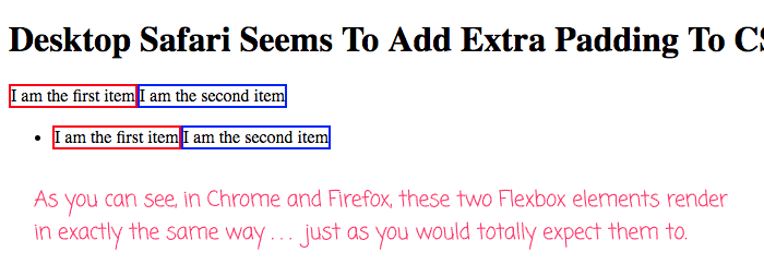
Here is this demo when rendered in Chrome or Firefox:

As you can see, the CSS Flexbox container has the same exact rendering both inside and outside the LI element. Just as you would expect it to.
This even renders almost correctly in IE 11. To be fair, the Flexbox element does render properly in IE 11; but, there is a strange top-padding within the LI element, above the Flexbox container.
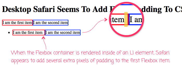
Now, here's the same page, rendered in Safari, Version 12.1.1 (13607.2.6.1.2):

As you can see, when rendered in the top-level BODY tag, the CSS Flexbox container renders fine in Safari. However, when that same exact Flexbox container is rendered inside of an LI element, the first Flexbox item has some mysterious right-padding of about 7px.
I could not figure out how to get rid of this padding. None of the CSS that I added to the LI or to the Flexbox elements seemed to make any difference. The only thing I could figure out was literally to not use an LI element with a Flexbox child.
Sorry that this post isn't about a solution to the problem - it's just here to let others on the Googles know that they are not alone. The struggle is real!
Want to use code from this post? Check out the license.
Reader Comments
I believe that Webkit is not ignoring the whitespace around your HTML. I bet if you remove the whitespace between your tags, the problem goes away.
@Dan,
I tried having the
<span></span><span></span>butt-up against each other, but that didn't seem to make a difference :(Applying
list-style-type: noneto the LI element fixes the issue for me. The culprit seems to be the list marker. Notice how if you changelist-style-type(fromdisc) to other values, the space at the end of the first flex item also changes in accordance with the currently rendered marker. This is a weird bug.@Šime,
Whoa, that is really weird :D I never would have even thought to try changing the marker type. But, good to know that removing the list-styling fixes the bug. Because, in reality, I use
display: flexinside of aullike all the time, but usually with alist-style-type:none. As such, this is a big relief that I don't have a lot of breaking UIs out there somewhere.