Leverage CSS user-select For A Better User Experience (UX)
There is a non-standard CSS property - user-select - which determines whether the text of a given element is selectable (ie, can be high-lighted by the user). I don't see this CSS property getting used very often. So, I wanted to write up a quick post about how I think the user-select property can be leveraged to create a better user experience (UX).
Run this demo in my JavaScript Demos project on GitHub.
First, this is not an issue of security. I would never use the user-select property to try and prevent "theft" of content. That's just a silly concept. That's like when people, in the early 2000s, used to attach an alert() prompt to the right-click action of an image in order to prevent the "Save As" functionality. Or, even more ridiculous, overlaying a transparent GIF on top of an image in order to intercept the click action. Just silly. Don't do these things.
To me, user-select is about providing a better user experience for the end user. I know, as a user myself, when I interact with an application, and some of the text is inappropriately high-lighted, it leaves a bad taste in my mouth. Now, I'm not suggesting that all text selection be prevented; but, rather, that "unintended" text selection be prevented.
Now, "unintended" is certainly a matter of interpretation. So, I tend to paint with a fine brush rather than with broad-strokes. For the most part, I find that preventing text selection on "action items" is a fairly safe bet. And, it's also one of the interaction points that is most likely to result in accidental text selection.
The user-select property is simple, but requires vendor-prefixes at this point:
user-select: none ;
-moz-user-select: none ;
-ms-user-select: none ;
-webkit-user-select: none ;
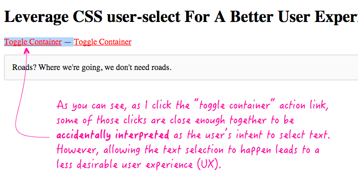
To demonstrate this, I've put together a small app in which a user can toggle an area of the page. If the user were to initiate the toggle action in a quick enough sequence, the browser may interpret that as a desire to select the text. One of the action links, in the demo, will allow that; the other action link will prevent accidental text selection using user-select.
| <!doctype html> | |
| <html ng-app="Demo"> | |
| <head> | |
| <meta charset="utf-8" /> | |
| <title> | |
| Leverage CSS user-select For A Better User Experience (UX) | |
| </title> | |
| <style type="text/css"> | |
| a.toggle { | |
| color: red ; | |
| cursor: pointer ; | |
| text-decoration: underline ; | |
| } | |
| /* | |
| By using the user-select CSS property (none), we can prevent accidental | |
| high-lighting of the action text. This is not here to prevent the user | |
| from copying the text; rather, it's here to prevent the user experience | |
| from being sub-par. | |
| */ | |
| a.toggle.b { | |
| user-select: none ; | |
| -moz-user-select: none ; | |
| -ms-user-select: none ; | |
| -webkit-user-select: none ; | |
| } | |
| p.container { | |
| background-color: #FAFAFA ; | |
| border: 1px solid #CCCCCC ; | |
| border-radius: 3px 3px 3px 3px ; | |
| padding: 15px 15px 15px 15px ; | |
| } | |
| </style> | |
| </head> | |
| <body ng-controller="AppController"> | |
| <h1> | |
| Leverage CSS user-select For A Better User Experience (UX) | |
| </h1> | |
| <p> | |
| <a ng-click="toggleContainer()" class="toggle a">Toggle Container</a> | |
| — | |
| <a ng-click="toggleContainer()" class="toggle b">Toggle Container</a> | |
| </p> | |
| <p ng-if="isShowingContainer" class="container"> | |
| Roads? Where we're going, we don't need roads. | |
| </p> | |
| <!-- Load scripts. --> | |
| <script type="text/javascript" src="../../vendor/angularjs/angular-1.4.5.min.js"></script> | |
| <script type="text/javascript"> | |
| // I control the root of the application. | |
| angular.module( "Demo", [] ) | |
| .controller( | |
| "AppController", | |
| function AppController( $scope ) { | |
| // I determine if the container is currently visible. | |
| $scope.isShowingContainer = false; | |
| // I toggle the visibility of the container. | |
| $scope.toggleContainer = function() { | |
| $scope.isShowingContainer = ! $scope.isShowingContainer; | |
| }; | |
| } | |
| ) | |
| ; | |
| </script> | |
| </body> | |
| </html> |
As you can see, one of the action links uses "user-select: none". This prevents the text of the action link from being accidentally selected during user interaction. However, since the first action link does not have this CSS property, clicking it in rapid succession leads to an unfavorable user experience:

I know this might seem really knit-picky; but, to me, adding the user-select property is a really easy way to prevent some fairly unfavorable user experiences. And, it can be done with fine-enough control so as to not accidentally prevent a desirable user interaction.
Want to use code from this post? Check out the license.
Reader Comments
Interesting. What do you think about applying this as a "blanket rule" to selectable elements?
```
a, button, label, [ng-click] {
user-select: none;
}
```
@Scott,
It's probably not a bad idea. Though, the "a" might be a bit over-reaching since it could easily be part of a "content paragraph" that the user does want to highlight and select. But, I think the [ng-click] will take care of the ones that are application-relevant.