The User Experience (UX) Of Container Store Parts Packaging
Last weekend, I bought a small set of shelves at the Container Store. We needed the shelves. But mostly, I just wanted an excuse to go to the Container Store (I mean, who doesn't, right?). Their products, much like Ikea's products, are fairly straightforward to assemble, although they often require a tedious number of steps. And, while each step is simple on its own, it's easy to get lost in the variety of parts and the orientation of surfaces laid out in the instructions. As such, I was delighted to open up the packaging and find a rather wonderful user experience (UX).
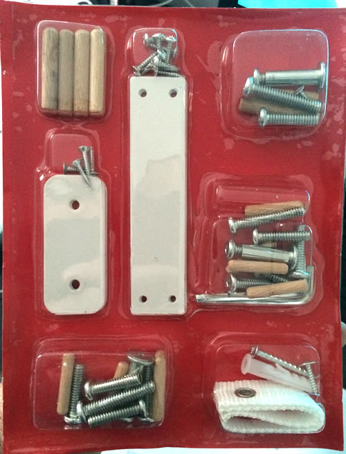
Unlike your typical "Bag-of-Parts" packaging, the Container Store parts come quarantined in individual little bubbles:
| |
|
|
||
| |
 |
|
||
| |
|
|
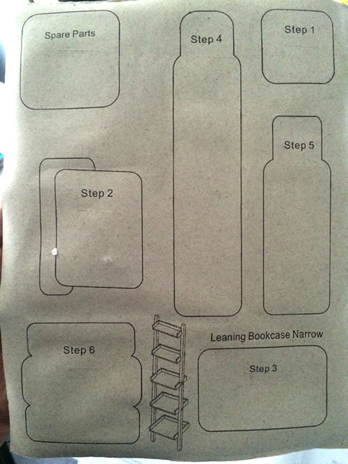
Flipping the packaging over and it is revealed that each bubble is associated with a single step in the assembly process:
| |
|
|
||
| |
 |
|
||
| |
|
|
NOTE: You gotta love the "Spare Parts" section. No more asking yourself, "Did I miss something?"
This is just brilliant. And, in hindsight, it's so obvious! And yet, this isn't how everyone is doing it. I feel like this kind of packaging is the result of continuously asking questions like:
- How can we make this process easier for the user?
- Where are the possible points of confusion?
- What aspects of the information might be open to misinterpretation?
- How can we make the data more actionable?
As user experience designers, we are tasked with both the creation of new features as well as the refinement of existing features. And, while new features certainly have more acute marketing and user acquisition steam (and can be more fun to design), I find that feature refinement can be better at strengthening long-term relationships with your current users. After all, if you give me a new feature, I may never use it; but, if you improve something I already use, I'm going to feel that benefit every time that I interact with the application.
Reader Comments
I just out together a small piece of furniture with the same ingenious packaging of parts. I had the exact same reaction as you with my mind immediately recognizing the UX implications. The best solutions are often the most simple and obvious in hindsight.
@James,
It's just so nice to be pleasantly surprised by a product.