The User Experience (UX) Of Trending Data
When it comes to trending data, I believe there are two types of consumption: active and passive. When you're actively analyzing trends in your software, that's when long-term, big-picture trends are critical - that's when real data science comes into play. When you're passively observing trends, however, the user experience (UX) is very different. Passively consuming data trends is more about human emotion and less about science.
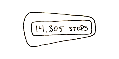
I own a Fitbit. That Fitbit now lays dormant and unused in a box in my closet. When I first got my Fitbit, however, it was really exciting - I used it every day. There was a thrill in mapping out my time in physical steps. After about two weeks, however, the thrill was gone; I came to realize that I walked about the same number of steps every day. As such, checking my Fitbit became boring - it was a predictable non-event.
| |
|
|
||
| |
 |
|
||
| |
|
|
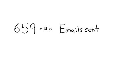
I use PostMark to send out the transactional emails created on this blog. Every week, PostMark sends me a "Weekly Digest" that reports the number of emails that I sent out. It also gives me a simple trend in how this week compared to last week. This email is exciting! When I see it in my inbox, it feels a little bit like opening up a CrackerJax box and looking for the prize.
| |
|
|
||
| |
 |
|
||
| |
|
|
The Fitbit and the PostMark "weekly digest" email do essentially the same thing. So, why are the user experiences so different for these two data presentations?
I think PostMark made two critical choices that helped to create an emotionally rich user experience (UX):
They picked a great interval. Sending out an email once a week feels like the perfect amount of time because it's frequent enough to keep PostMark vaguely in your mind; however, it's also infrequent enough such that it neither feels like noise, nor does it allow you to build and maintain a comprehensive trend-line in your mind. As such, you never quite know what to expect when you open the email.
They present trending data in two-week chunks. By this, I mean that they tell you how many emails you sent this week and then compare it - percent-wise - to that previous week. This gives you almost no long-term insight - no overall trend; but, it allows you to "feel" short-term victories and defeats. When you open the email, there's the anticipation of change followed by the warm glow of victory (trending up) or cold shoulder of defeat (trending down).
Essentially, the PostMark "weekly digest" email operates like a slot machine. Each pull of the lever (email) presents an emotional silo that has an unpredictable outcome.
When you present trending data in your software, you need to figure out why you're doing it. Are you doing it because you believe that the user will make serious use of it? Or are you doing it because you believe, "people like to see numbers." If it's the latter (which I assume it is most of the time), play into it. Don't pretend that you're enabling your users to become data scientists - find ways to make the data more enjoyable and less informational.
Reader Comments
Definitely agree with this. Also, aside from intervals, creating something that you invest a lot of time and passion into has a more rewarding feeling than anything, especially if it presents desired results. For me, anyways..
@Joshua,
Yes, very true. My blog does have the unfair advantage in that I am very emotionally invested in it.