Using CSS Fixed Position Elements Across Browsers Without Javascript
Yesterday, I posted my first experimentation with CSS fixed-position elements and getting them to work across all browsers, including IE6. The solution I demonstrated yesterday involved using proprietary Javascript expressions in the CSS that would be used by IE6; this technique worked pretty well, but caused a jittery effect as the "fixed" position elements repositioned themselves during page scroll.
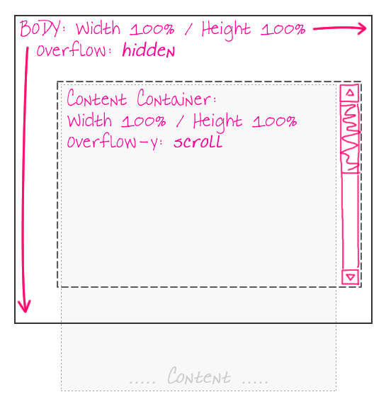
While I was doing research on using the "position: fixed" CSS property, I came across two solutions for getting fixed-position elements in IE6. The first was the one that I demonstrated yesterday; the second one was to fake fixed-position elements by making them absolutely-positioned elements. In order to get that to work, however, we need to move the primary content out of the BODY tag and into a sub-content tag. This way, the BODY tag can have a height / width of 100% which will work for absolutely-positioned elements, while the sub-content container can take care of the scrolling:

With this page architecture, since the BODY tag does not scroll, elements within the BODY tag, but outside the sub-content container, can be positioned absolutely and will act just as if they were fixed-position elements. Here is the sample page that I created:
<!DOCTYPE HTML>
<html>
<head>
	<title>Using CSS Fixed Position Across Browsers</title>
	<style type="text/css">

		html,
		body {
			margin: 0px 0px 0px 0px ;
			padding: 0px 0px 0px 0px ;
			}

		#site-body-container {}

		#site-body-content {
			padding: 15px 15px 15px 15px ;
			}

		div.fixed-position {
			background-color: #F0F0F0 ;
			border: 1px solid #CCCCCC ;
			height: 48px ;
			line-height: 50px ;
			position: fixed ;
			text-align: center ;
			width: 148px ;
			z-index: 1000 ;
			}

		div.fixed-n {
			left: 50% ;
			margin-left: -75px ;
			top: 0px ;
			}

		div.fixed-n-e {
			right: 0px ;
			top: 0px ;
			}

		div.fixed-e {
			margin-top: -25px ;
			right: 0px ;
			top: 50% ;
			}

		div.fixed-s-e {
			bottom: 0px ;
			right: 0px ;
			}

		div.fixed-s {
			bottom: 0px ;
			left: 50% ;
			margin-left: -75px ;
			}

		div.fixed-s-w {
			bottom: 0px ;
			left: 0px ;
			}

		div.fixed-w {
			margin-top: -25px ;
			left: 0px ;
			top: 50% ;
			}

		div.fixed-n-w {
			left: 0px ;
			top: 0px ;
			}


		/* -------------------------------------------------- */
		/* -- IE 6 FIXED POSITION HACK ---------------------- */
		/* -------------------------------------------------- */

		html,
		body,
		#site-body-container {
			_height: 100% ;
			_overflow: hidden ;
			_width: 100% ;
			}

		#site-body-container {
			_overflow-y: scroll ;
			_overflow-x: hidden ;
			_position: relative ;
			}

		div.fixed-position {
			_position: absolute ;
			}

		/* For the scrollbar. */
		div.fixed-n-e,
		div.fixed-e,
		div.fixed-s-e {
			_margin-right: 16px ;
			}

		/* For the scrollbar. */
		div.fixed-n,
		div.fixed-s {
			_margin-left: -83px ;
			}

	</style>
</head>
<body>

	<div class="fixed-position fixed-n">
		North
	</div>

	<div class="fixed-position fixed-n-e">
		North East
	</div>

	<div class="fixed-position fixed-e">
		East
	</div>

	<div class="fixed-position fixed-s-e">
		South East
	</div>

	<div class="fixed-position fixed-s">
		South
	</div>

	<div class="fixed-position fixed-s-w">
		South West
	</div>

	<div class="fixed-position fixed-w">
		West
	</div>

	<div class="fixed-position fixed-n-w">
		North West
	</div>

	<!-- ------- -->
	<!-- ------- -->

	<div id="site-body-container">
		<div id="site-body-content">

			<div style="height: 3000px ;">

				<p>
					Lorem ipsum dolor sit amet, consectetur
					adipiscing elit. Aliquam dictum enim in mauris
					luctus convallis. Aliquam erat volutpat.
					Suspendisse potenti. Duis blandit, urna vitae
					feugiat porttitor, risus est ornare metus, at
					dignissim urna velit id enim. Donec lectus nisi,
					consectetur eget sollicitudin id, bibendum
					laoreet velit.
				<p>

			</div>

		</div>
	</div>

</body>
</html>
You'll notice that the standards-compliant browsers still use "position: fixed". Only IE6 (with the help of the underscore ("_") hack since my IE doesn't allow conditional comments) falls back on this sub-content container work around. Because the content scrollbars are not part of the main window, our right-aligned and center-aligned "fixed" position elements need to take some additional margin into consideration to prevent overlapping with the content container's scrollbar.
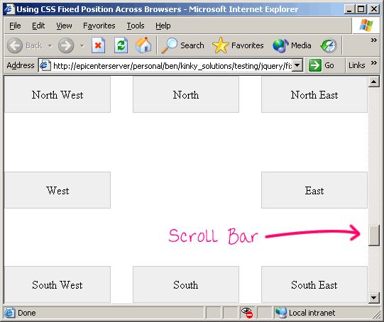
Here is a screen shot of IE6 using the above code:

And, since this solution does not use any proprietary IE-based Javascript expressions, scrolling around the window does not lead to any jittering.
Want to use code from this post? Check out the license.
Reader Comments
Nice article.
I want to add important note about this usage.
If !Doctype is not used, position:fixed doesn't work on Internet Explorer.
Nice solution.
It may interest you to watch this screencast (in Russian only, sorry) - http://www.artlebedev.ru/tools/technogrette/html/emulate-fixed/
Examples can be downloaded by clicking ??????? at the bottom of the page.
@Memiso,
I hope people are *always* using doctypes.
@Oleg,
Thanks, I'll take a look.
Doctype really cause lot's of issue with IE6
Is there any ways to disable scroll bar, because it is unnecessary.
@Anil,
I am not sure you can remove them when not necessary. I know you can add them when not necessary.
I'm wondering, in your example above:
/* -- IE 6 FIXED POSITION HACK ---------------------- */
/* -------------------------------------------------- */
html,
body,
#site-body-container {
_height: 100% ;
_overflow: hidden ;
_width: 100% ;
}
#site-body-container {
_overflow-y: scroll ;
_overflow-x: hidden ;
_position: relative ;
}
do you think your second "#site-body-container" was meant to be "#site-body-content"
#site-body-content" would be missing and it wouldn't make sense that you had called out "#site-body-container" twice
Apart from that -Thanks for this really well organized tutorial. Best I've ever seem in regards to making your point succinctly.
@Stacey,
Without having the code in front of me, it definitely looks a bit confusing to run; but, I think it is accurate. The reason it is repeated is because it is sharing the height/width definitions with the html and body elements.
Admittedly, this is confusing. I was probably trying to be clever. In reality, I would have broken those apart and just defined the site-body-container once.
That said, thank you for the kind words!
Nice article. thank you.
But how can i position elements fixed, which are NOT fixed-width ?
it means, width of elements are flexible by contents...
@Chamisak,
This should work with non-fixed-width elements. You can always position an element with an automatic width. However, whether or not that typically works for a good layout - that is on a per-case basis. But, at the end of the day, as long as you position the element, you should be fine.
Do you have a fix for IE8? It's not scrolling properly, and I cannot figure it out.
Now my css for jswindow has a fixed and centered position but, that fixed position is refering at the iframe from page2.
My question is how can i make position against the page2 and not the inside iframe?
Is there a posibility to do that using css? or i have to javascript?
Anyone got a sugestion for this?
MEMISO: You saved my life on this with the !DOCTYPE point. Thank you!!
Terrific! I easily place fixed position at every corner but found problem in centering. Sure this great article kill my headache. Good Job!
Can anyone tell me, how to make a widget sticky using the same concept?
We need not be tricky to make across combat-able fixed layer.
Just add the line
<meta http-equiv="X-UA-Compatible" content="IE=edge" />
in the header and use fixed positioning in css. Tested in
Thank you
George Thengummoottil
We need not be tricky to make across combat-able fixed layer.
Just add the line
<meta http-equiv="X-UA-Compatible" content="IE=edge" />
in the header and use fixed positioning in css. Tested in ie,ff,gc,op
Thank you
George Thengummoottil