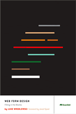
Web Form Design By Luke Wroblewski
The other night, I finished, "Web Form Design" by Luke Wroblewski. In it, Luke Wroblewski discusses everything you'll ever need to know about designing web forms in your applications. He covers a myriad of topics including common strategies among the internet giants, label placement, dynamic forms, button placement, eye tracking, field size, field requirements, field spacing, help text and help text placement, error handling, real-time feedback, color selection, visual keys, icon selection, simplifying forms, how form design directly impacts company revenue, dozens of real-world web forms, and, of course, some "worst practice" examples. In short, this book is jam-packed with valuable information. I am positive that there is far too much for me to absorb in one sitting; surely, this book will become and often-used reference book in my library.
| |
|
|
||
| |
 |
|
||
| |
|
|
Aside from the content, the book itself is simply beautiful. Glossy paper, full color graphics, strong binding, thick stock; everything about the book is a testament to pleasing design. And, at just over 200 small pages, it's a quick read; I finished it over the course of a few nights.
I definitely came away from this book feeling like I needed to take way more care with my web forms. I need to stop looking at them as an after thought - as a way to simply move information into the database; I need to start leveraging my forms to craft a pleasing user experience.
Anyway, I highly recommend this book to all interface designers.

Reader Comments
I haven't read the book yet, but I did get to attend a seven hour workshop on web form design given by Luke W. and he _really_ knows form design. I would definitely recommend his book based on the info he gave in his presentation.
@Nathan,
Seven hours sounds intense :) Especially when its all web form design! This book feels the same way. A lot to internalize. Will probably take many visits to its teachings to get on the right path.