CSS Background Images Using Percentage Positioning
One of the techniques that Dan Cederholm uses widely in Bulletproof Web Design is the positioning of background images using percentages. Up until now, I have only ever used either pixel placement or keyword placement using TOP or LEFT to position background images. As such, I was a bit confused as to how the percentage positioning even worked. To explore this, I set up a small demo page using this background image:

This image is 400 pixels wide. Vertical rules are placed every 100 pixels with the green background covering the last 25% of the image (300 - 400 pixel area). I have done this so that we could easily see where the 75% point in the image is. Then, I wrote this demo page:
<!DOCTYPE html PUBLIC "-//W3C//DTD XHTML 1.0 Transitional//EN" "http://www.w3.org/TR/xhtml1/DTD/xhtml1-transitional.dtd">
<html>
<head>
	<title>CSS Background Position By Percent</title>

	<style type="text/css">

		div {
			background-image: url( "./75_percent.gif" ) ;
			background-position: 75% top ;
			background-repeat: releat-y ;
			border: 1px solid #666666 ;
			font: 12px verdana ;
			line-height: 50px ;
			margin-bottom: 25px ;
			}

		div.w50 {
			width: 50px ;
			}

		div.w100 {
			width: 100px ;
			}

		div.w200 {
			width: 200px ;
			}

		div.w300 {
			width: 300px ;
			}

		div.w400 {
			width: 400px ;
			}

	</style>
</head>
<body>

	<div class="w50">
		50
	</div>

	<div class="w100">
		100
	</div>

	<div class="w200">
		200
	</div>

	<div class="w300">
		300
	</div>

	<div class="w400">
		400
	</div>

</body>
</html>
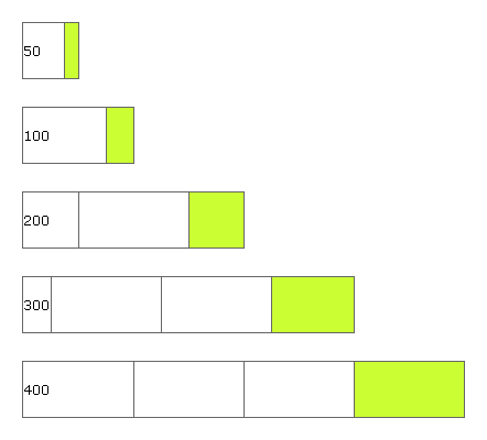
As you can see, every DIV on the page puts the background image at a left position of 75%. Running the code, we get the following output:

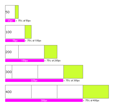
When I saw this output, things became a bit more clear. Seeing the iterative behavior over different widths was more obvious than the one-off examples in Bulletproof Web Design. I have added some explanation text over the page output:

As you can see here, when using a percentage position for top or left of a background image, the process has two parts. The first part is placing the "thumbtack". The thumbtack is the point on the image that will be used for contextual placement. When using a left value of 75%, the thumbtack is placed at the 75% horizontal mark on the image, which on our image is where the green color starts. The second part of placement is the contextual placement within the DOM element background. This takes the thumbtack from step one and places it 75% from the left most point of the parent element.
To word it in english, positioning a background image at 75% left finds a point on the image that is 75% of the horizontal distance and then places that point at 75% of the horizontal distance of the parent element. This is a bit wordy, but when you understand this, making flexible layouts will become so much easier. I wish this is something that I knew a long time ago.
Want to use code from this post? Check out the license.

Reader Comments
Thanks for your information, was very useful..Nice site
and does it work when you say releat?
This is very clever. I didn't think it was possible. I had to read your article three times to actually get it.
This is a great technique when you have a background image with two colors say one to the left and one the right. And you want to place the dividing line between the two colors at a percentage position. The only thing to know is that for each percentage position you want you'll need to create a separate background image.
I can't find the words to thank you.
This has been confusing me and I have a much better understanding of this now. Thanks. The thumbtack analogy is excellent!
Thank you for taking time to share this but I still don't get it. How does the browser know to start at the edge of the green? It's one solid image, right? Why doesn't it measure from either the left or the right edge of the image?
I too dont have words to express my thankfulness.. This article has given a logical end to everything I tried to understand the concept behind what was happening!
@hugh,
while placing it is still using the entire image, its like moving the entire image in such a way that, the 75th% of the image is at 75% offset of the parent element's width.